| Author | Thread |
Comments Made During the Challenge  |
|
|
11/18/2003 04:54:39 AM |
|
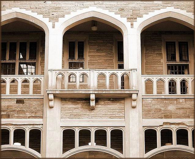
Arguably not a book, but I'm not splitting hairs. I think the perspective distortion really hurts this image. Also perhaps you haven't got far enough away, or you've cropped too close - including what I presume are more pillars either sie of these archways would emphasise the repetition more fully. As it is ... well, solid photography, but there's no drama, no mystery - if you could have shot it at night, with light streaming out of just one window ... |
|
 Photographer found comment helpful. Photographer found comment helpful. |
|
|
11/14/2003 09:23:42 PM |
|
This is a great idea for the Romeo and Juliet title. Can't go wrong with a balcony. |
|
|
|
11/14/2003 08:16:26 PM |
|
Nice flow to the composition of the shot- but wherefore art thou, contrast? |
|
|
|
11/13/2003 09:11:37 PM |
|
The picture itself is nice, though it's a bit asymmetrical. A bit cropped off the right would help that part, if you're interested in symmetry. But the title isn't directly reflected in the photo. Romeo and Juliet did have a lovely balcony scene, but without having read the play or seen the movie, a person couldn't know that. |
|
| Photographer found comment helpful. |
|
|
11/13/2003 09:35:32 AM |
|
balconies but no lovers? nice shot buyt I wish it were better centered |
|
| Photographer found comment helpful. |
|
|
11/13/2003 12:17:24 AM |
|
I like this image. I find the textures and colours and shadings very well done. The only thing that might have made it better is to crop more for the whole symetry aspect. A little more cropping on the right side to even things out. Still, excellent image. 7 |
|
| Photographer found comment helpful. |
|
|
11/12/2003 06:45:44 PM |
|
Here a model, in the balony would have added lots of life. |
|
| Photographer found comment helpful. |
|
|
11/12/2003 03:22:38 PM |
|
Technically nice job, I am just missing some life from the corridors. For example 2 models, one for Romeo, and one for Juliet, without them it seems a bit empty, something that is lack of the most importantsubject. Anyway, sepia colours work well here. :-) |
|
| Photographer found comment helpful. |
|
|
11/12/2003 01:50:29 PM |
|
Wonderful building..looks just like I would have imagined. Good find. The light is a little bright but I did enjoy seeing this. |
|
| Photographer found comment helpful. |
|
|
11/12/2003 01:15:27 PM |
|
Where are the Romeo, and what about the Juliet? |
|
|
|
11/12/2003 12:17:01 PM |
|
this is a picture representing the content of the story, not a picture of the title. |
|
|
|
11/12/2003 12:03:18 PM |
|
seems to be a bit crooked ... |
|
|
|
11/12/2003 06:25:03 AM |
|
Interesting architecturally, and well done as a photo, but I think the picture needs some people to make the title |
|
| Photographer found comment helpful. |
|
|
11/12/2003 03:34:33 AM |
|
Looks more like a library than a romantic spot |
|
|
|
11/12/2003 01:31:41 AM |
|
with a shot like this, symetry is everything |
|
| Photographer found comment helpful. |
Home -
Challenges -
Community -
League -
Photos -
Cameras -
Lenses -
Learn -
Help -
Terms of Use -
Privacy -
Top ^
DPChallenge, and website content and design, Copyright © 2001-2026 Challenging Technologies, LLC.
All digital photo copyrights belong to the photographers and may not be used without permission.
Current Server Time: 06/28/2026 08:43:59 AM EDT.