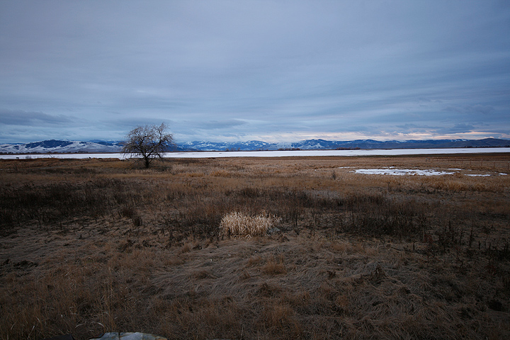
Minimal subject matter but not really minimalism artistically/photographically. And while this is a beautifully captured scene nonetheless, it still could use some technical improvement by moving the horizon either up or down ... versus almost right across the middle of the frame.
I think there's too much foreground. Seems to detract a bit from the subject and the strong line of the horizon, and it contains many distracting elements. Good use of hyperfocal distance though.
The photo has potential, but two issues keep me from voting higher. The first issue is the horizon being really close to the middle of the frame, and secondly, the horizon is not level.






 Add photograph to your favorites
 Add photographer to your favorites


 Photographer found comment helpful.


