| Author | Thread |
|
|
02/07/2007 11:58:06 AM |
|
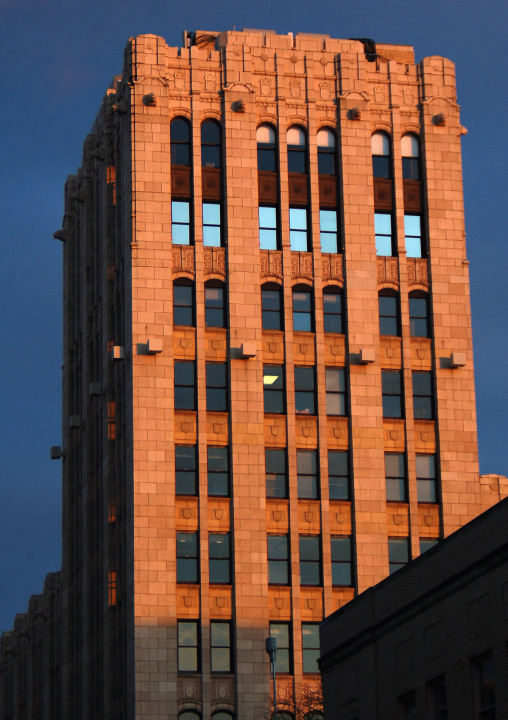
The thing I liked about this one in voting (I gave it a 6) was the reflection in the upper windows - really made this more than just a building shot, in my opinion. Skewsme's suggestions are interesting - particularly the one about a cow on the roof.... |
|
 Photographer found comment helpful. Photographer found comment helpful. |
|
|
02/05/2007 11:22:47 AM |
Hi Bob
I liked this and gave it a 6. The red light is so pretty on the bricks and the line of blue windows is really cool. Good color complementation with the rust and the blue sky. With advanced or expert editing, one thing to to consider is that you can lightly hand-burn some of the details back into the building, and clone out that lone ceiling light in the middle. Oh and with expert editing, if you're a lunatic like me, you might put something comical in one of the windows or on the roof - somebody waving or something, or a cow.... ;-) |
|
| Photographer found comment helpful. |
|
|
02/02/2007 08:27:18 AM |
Bob,
I felt when voting that there was somthing slightly askew on the perspective and that it may be just a tad underexposed. However, I love the blue line of windows - adds a lot of drama. It's an interesting shot with a lot of potential. |
|
| Photographer found comment helpful. |
|
|
02/02/2007 02:34:18 AM |
|
as per below if the building was the only element this would have been more punchy. nice colour on the building though |
|
| Photographer found comment helpful. |
Comments Made During the Challenge  |
|
|
01/26/2007 05:40:20 PM |
|
I think this would have been better if you only included the building in your frame, with no sky visible. It's a really nice photo though. |
|
| Photographer found comment helpful. |
|
|
01/26/2007 10:15:13 AM |
|
Your subject takes up most of the frame, but it doesn't fill the frame to me. I like the warm lighting, looks like a sunrise or sunset saturation. The dark building in the lower right corner is bothersome. |
|
| Photographer found comment helpful. |
|
|
01/26/2007 05:31:29 AM |
|
Tighter crop to fill the frame would have made it more appropriate in this challenge for me |
|
| Photographer found comment helpful. |
|
|
01/26/2007 02:10:33 AM |
|
| Photographer found comment helpful. |
|
|
01/26/2007 01:16:47 AM |
|
| Photographer found comment helpful. |
|
|
01/26/2007 01:05:47 AM |
|
Requires a little correction to the perspective, which I guess you could have done in 'Expert'. |
|
| Photographer found comment helpful. |
Home -
Challenges -
Community -
League -
Photos -
Cameras -
Lenses -
Learn -
Help -
Terms of Use -
Privacy -
Top ^
DPChallenge, and website content and design, Copyright © 2001-2026 Challenging Technologies, LLC.
All digital photo copyrights belong to the photographers and may not be used without permission.
Current Server Time: 06/28/2026 10:32:50 PM EDT.