| Author | Thread |
|
|
04/07/2007 11:12:52 AM |
|
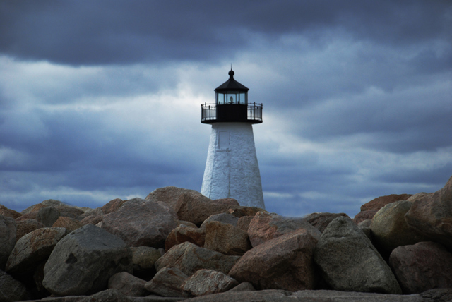
beautiful bold colours, a very brave centering of the lighthouse... |
|
 Photographer found comment helpful. Photographer found comment helpful. |
|
|
03/23/2007 12:36:26 PM |
/
Message edited by author 2007-03-23 12:38:04. |
|
| Photographer found comment helpful. |
|
|
03/23/2007 10:27:37 AM |
Amazing look! It caught my eye, amongst a whole page of other photos. I seen Bear Music's advice photo, and I must admit I like the comp he used. I would also add to his, just a smidgin of dodge/clone.
I've been using some new techniques for my grainy skies, you know to smooth em out a little. It works to a moderate extent, I would share the technique if your interested. (I call it new, probably not, but something I have just recently realized, LOL.) |
|
| Photographer found comment helpful. |
|
|
02/22/2007 11:34:07 AM |
Jeff,
this is a moody shot with a lot of potential, much of it unrealized. The composition is an issue, because it is very static, with the lighthouse too centered for the powerful, turbulent context of the image. It's also very fuzzy-looking. There doesn't seem to be much you can do about that, but you CAN reframe the image if you like to give more dynamic power to the composition, something like this... I have also added in some USM and adjusted the levels for more pop.

Robt.
Message edited by author 2007-02-22 11:35:46. |
|
| Photographer found comment helpful. |
Comments Made During the Challenge  |
|
|
02/06/2007 10:24:21 PM |
|
Great capture. I like the centered comp but its not a favorite on DPC. I hope they're not killing you. |
|
| Photographer found comment helpful. |
|
|
02/05/2007 10:55:43 AM |
|
great capture but a bit unsharp |
|
| Photographer found comment helpful. |
|
|
02/04/2007 04:23:34 PM |
|
I would prefer a less centered composition - I think this could be really strong if the lighthouse was on the left hand 'third' line. |
|
| Photographer found comment helpful. |
|
|
02/03/2007 11:14:46 PM |
|
Nice job. Looks like very minimal processing also. |
|
| Photographer found comment helpful. |
|
|
02/03/2007 04:12:50 PM |
|
Very nice, love the clouds and the rocks sets a great atmospher |
|
| Photographer found comment helpful. |
|
|
02/03/2007 02:17:01 PM |
|
| Photographer found comment helpful. |
|
|
02/01/2007 09:02:27 AM |
|
How pretty. I like the centering of the subject, which usually isn't my favorite way of displaying a single subject. The texture of the rocks in the forground really ground it. Lovely sky!!! |
|
| Photographer found comment helpful. |
Home -
Challenges -
Community -
League -
Photos -
Cameras -
Lenses -
Learn -
Help -
Terms of Use -
Privacy -
Top ^
DPChallenge, and website content and design, Copyright © 2001-2026 Challenging Technologies, LLC.
All digital photo copyrights belong to the photographers and may not be used without permission.
Current Server Time: 06/29/2026 02:19:43 AM EDT.