CRITIQUE CLUB CRITIQUE
by karmat
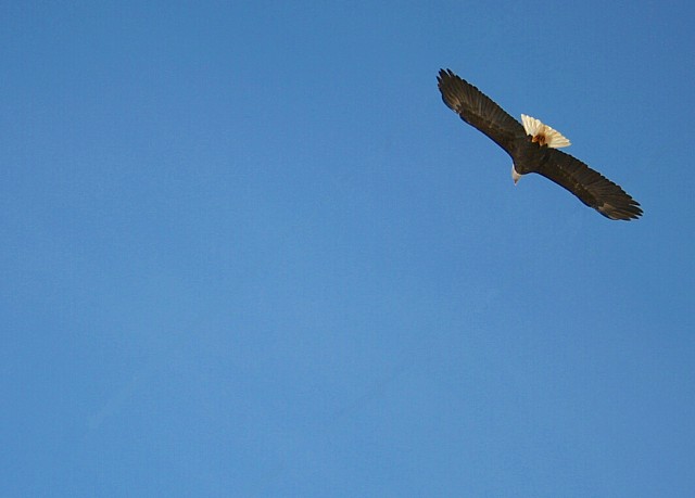
Compositionally, this is a strong picture. The bird is located roughly on the upper right third and this gives a sense of balance to the shot. Also, while this location of the subject can sometimes feel out of balance, the fact that the bird is flying "into" the frame helps. The negative space gives the sense of freedom that one can sometimes associate with birds.
Technically, the shot is focus and exposed well. The colors are simple, so they aren't distracting, and the bird shows up well on the blue sky. I do notice a couple of streaks, and after reading your notes, I'm wondering if it is where you cloned out your powerlines. In normal voting, I'm not sure I would have noticed it, but in studying the picture to critique it, I can't miss it, and now when I glance at the shot it "jumps" out at me. If you can't see it on your monitor, try boosting the levels or curves and see if anything shows up. Also, you have good detail on the wings. Good work. Unfortunately, that is one of those details that may not grab the voter on a typical pass, and thus you weren't "rewarded" for it in the scoring.
Overall, the shot is good. It isn't "WOW" and it isn't earthshattering. It is a technically well shot picture. Looking at your scores, most people seem to think that it falls somewhere in the middle. So, while I think the composition works, to make it more dramatic, it may have helped to use a tighter crop, or to crop it in an unusual way. This would help to get the attention of the voters.
Please feel free to contact me if I need to further elaborate or explain anything I've said.
karmat
|