| Author | Thread |
Comments Made During the Challenge  |
|
|
11/11/2003 07:52:26 PM |
|
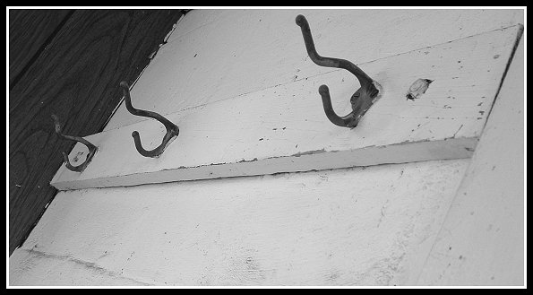
Well seen - also got the 3's rule , 4 hooks would have looked just odd. Only lacks a little in the sharpnees department 7 |
|
|
|
11/11/2003 12:51:49 PM |
|
For whatever reason this is cool -- I think it is the slant. After all , where would we be without coat hooks? |
|
|
|
11/11/2003 10:42:31 AM |
|
There is one thing that you should change about this, and it's glaring. Get that regularly stained wood panel on the right side out. Get it out! Zoom in, work more closely with your subject. Don't be afraid to NOT show the whole scene; it illustrates that you are unafraid as a photographer and willing to take risks in the pursuit of a perfectly crafted composition. You need to exploit the texture, the feeling of the wood grasping these hooks. |
|
|
|
11/08/2003 02:01:28 PM |
Great subject and choice of B/W for this shot. I don't like the angle that you chose though.
TC |
|
|
|
11/06/2003 03:27:51 PM |
|
Simple, effective and good use of b&w. 6 |
|
|
|
11/06/2003 09:55:50 AM |
|
not sure about the angle. Something could have been improved in this photo to make it a little more eye-catching - like lighting or composition. |
|
|
|
11/05/2003 01:45:58 PM |
|
A unique idea and you get a point for that. But the shot itself is wanting, the angle, the color, the lack of light or contrast and the panel in the back is very distracting. A 3 |
|
|
|
11/05/2003 11:47:02 AM |
|
The angles throws for a loop and keeps me from enjoying this simple image and I find that it's made worse by the heavy double border. |
|
Home -
Challenges -
Community -
League -
Photos -
Cameras -
Lenses -
Learn -
Help -
Terms of Use -
Privacy -
Top ^
DPChallenge, and website content and design, Copyright © 2001-2026 Challenging Technologies, LLC.
All digital photo copyrights belong to the photographers and may not be used without permission.
Current Server Time: 06/29/2026 05:00:04 AM EDT.