| Author | Thread |
Comments Made During the Challenge  |
|
|
01/25/2007 09:44:50 PM |
|
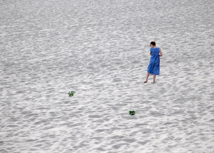
Excellent shot. Only criticism is that I don't like the green (distracting). Nonetheless a great job. Good Luck |
|
 Photographer found comment helpful. Photographer found comment helpful. |
|
|
01/25/2007 08:26:35 PM |
|
This would have been even better with more space between the girl and the plants, and a lower perspective. You really got something going on here, I like it. :-) 7 |
|
| Photographer found comment helpful. |
|
|
01/25/2007 12:02:11 AM |
|
i sense what you wanted to do here, but something leaves this feeling a bit strange. not really able to put my finger on it, though. |
|
| Photographer found comment helpful. |
|
|
01/24/2007 11:54:36 PM |
|
Minimalism, works really well in this one... |
|
| Photographer found comment helpful. |
|
|
01/24/2007 10:52:30 PM |
|
very nice, i like how this conveys the rule of thirds |
|
| Photographer found comment helpful. |
|
|
01/23/2007 10:37:31 PM |
|
a sea of sand. unforgettable photo. 9 |
|
| Photographer found comment helpful. |
|
|
01/22/2007 01:40:26 PM |
|
Good use of the open space, well done |
|
| Photographer found comment helpful. |
|
|
01/18/2007 03:01:10 PM |
|
I would have zoomed on your subject more. |
|
| Photographer found comment helpful. |
|
|
01/18/2007 05:22:09 AM |
|
good use of negative space, tho i cant really feel anything from all this. she looked more like she was walking along the beach than Lost (image title), but then again, that's not all that important. Maybe a tighter crop would be my preference. Gotta say i like the details on the main subject tho! |
|
| Photographer found comment helpful. |
|
|
01/17/2007 11:08:53 AM |
|
Nice a simple, I would have liked to see it without the 2 plants they distract from the girl. Great composition. |
|
| Photographer found comment helpful. |
|
|
01/17/2007 08:27:23 AM |
|
| Photographer found comment helpful. |
|
|
01/16/2007 11:53:06 PM |
|
Good use of selective color, and with the triangle formed by those objects. |
|
| Photographer found comment helpful. |
|
|
01/16/2007 12:30:20 PM |
|
Not sure what sort of processing you did with this but the girl looks to be floating. I love the textures in the sand but I am not fond of the girl |
|
| Photographer found comment helpful. |
|
|
01/15/2007 06:18:23 PM |
Great eye to see this... I might have named it "Dancing with partners" though, looks like she is dancing with the two bushes
Jack |
|
| Photographer found comment helpful. |
|
|
01/15/2007 03:03:52 PM |
|
| Photographer found comment helpful. |
|
|
01/15/2007 05:59:14 AM |
|
I really like this one, great capture! |
|
| Photographer found comment helpful. |
|
|
01/13/2007 04:10:30 PM |
|
Excellent photo. I like the minimalism here. Good luck! |
|
| Photographer found comment helpful. |
|
|
01/13/2007 02:04:34 AM |
|
This is so simple and yet so elegant and beautiful. I love the minimalist look to it -- and that perfect splash of blue from her dress. Excellent! |
|
| Photographer found comment helpful. |
|
|
01/12/2007 10:36:49 PM |
|
attack of the little bushes! |
|
|
|
01/12/2007 06:11:03 PM |
|
This would be better if the girl was looking towards the camera. |
|
| Photographer found comment helpful. |
|
|
01/12/2007 03:10:16 PM |
|
The size, colour and placement of your subject on that huge amount of sand looks really good. I didn't like the 2 other things there at first but after a while I think they give a bit a balance to the shot. Overall it's great shot. |
|
| Photographer found comment helpful. |
|
|
01/12/2007 01:35:32 PM |
Best: Scenery..are those little bushes?
Worst: Just a little bland...needs more shadows in the sand.. |
|
| Photographer found comment helpful. |
|
|
01/12/2007 11:18:23 AM |
|
Wonderful use of minimalism. The texture of the sand as well as the two patches of grass really add to the shot. NICE!!! I like the square crop too. |
|
| Photographer found comment helpful. |
Home -
Challenges -
Community -
League -
Photos -
Cameras -
Lenses -
Learn -
Help -
Terms of Use -
Privacy -
Top ^
DPChallenge, and website content and design, Copyright © 2001-2026 Challenging Technologies, LLC.
All digital photo copyrights belong to the photographers and may not be used without permission.
Current Server Time: 07/16/2026 12:52:27 PM EDT.