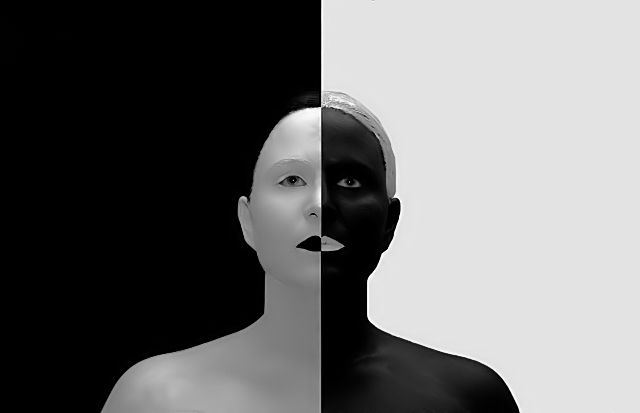
This is actually acrylic paint! I did some dodge/burn, painted the white background because of some fabric wrinkles, cloned out a shadow behind my left ear, cleaned up little hairs that were sticking out, applied a 6px line on either side (one black, one white) to clean up the line and also used a healing brush to straighten it up down my body, cloned out all but where the lines I added crossed for a cleaner look, adjusted contrast, levels, did a desat, cropped, and resized for contest. Took me 3 days to get all of the paint out of my hair :D Added one layer of neat image.
Statistics
Place: 166 out of 559 Avg (all users): 5.9803 Avg (commenters): 8.0000 Avg (participants): 5.9322 Avg (non-participants): 6.1471 Views since voting: 1741 Views during voting: 283 Votes: 152 Comments: 16 Favorites: 2 (view)
You know, this nice creation was simply lost on that challenge. Which just seems to say, choose your battles. It's an extraordinary photo which could be made even better with a tighter cropping. All your effort was worth it.
I've given this style a whirl just using lights. It's a lot of work. A whole lot more than one might appreciate if they never tried it (especially when doing a self-portrait. The fact that you used paint doesn't really lessen that.
A truly extraordinary pic.
Brilliant idea about the 6 pixel line too. Hard to notice in the resized version. I wonder if you used a color sampled from your skin, you might be able to avoid that very, very slight brightness.
This is an incredible picture, obviously a tremendous amountof work and thought went into making this, I certainly enjoy it. This again is about symmetry as the central point, the trouble is - there really isn't anyplace to rest your eyes - I keep moving about trying to find a place to focus, but I can't find it. The eyes are critical as others point out, this is the one place where the symmetry is broken, but becasue they aren't focused on the viewer they also don't capture attention. Perhaps another area of symmetry break would have made the difference between a really good shot and a great one - again, all just my opinion. Thanks again for your efforts though, you've definately stretched us all a bit.
Ok, someone has WAY too much time on their hands!!! :P
I think jaysonmc hit most of the points on his critique regarding your photo. For me the first thing I notice are the eyes. If they "engaged" the viewer this would have gained .25 - .50 point in score at least IMO (I didn't vote on this BTW). The second thing I notice is the greyscale white on the left. Had that been tweaked closer to true white you'd probably gained another .25 - .50 in score.
Just some observations. Smile and keep having fun! :D
Responding from thread post. Terrific idea and concept. Nice light capture in the eyes. A couple of things to point out why this might not have scored as well as you hoped. White on the left side doesn't quite match white on the right side. I think that is critical for this effect. They eyes, while nice light is kind of looking up disengaging the viewer. Also a little too sharp, there are noticeable jaggies around the person's frame and lips.
This are pretty minor things though to an excellent shot. A 5.9 is an excellent score especially considering this is a Free Study. Incidently, I this voted at a 6.





 Add photograph to your favorites
 Add photographer to your favorites

 Photographer found comment helpful.


