DPChallenge: A Digital Photography Contest You are not logged in. (log in or register
 
Challenge Entries
Portfolio Images
This image is not part of a public portfolio.
Eye of the Beholder
Eye of the Beholder
vertigoreality


Photograph Information Photographer's Comments
Challenge: Black and White Portrait II (Advanced Editing V*)
Camera: Pentax K10D
Lens: Sigma 18-50mm f/2.8 EX DC for Nikon
Location: Toronto, Ontario
Date: Jan 6, 2007
Aperture: 2.8
ISO: 200
Shutter: 0.3
Galleries: Portraiture, Black and White
Date Uploaded: Jan 9, 2007

Not much done here.
Converted to BW using Channel Mixer
Burned a touch around the eye lids
Sharpened the eye
levels

Statistics
Place: 219 out of 491
Avg (all users): 5.3527
Avg (commenters): 6.0000
Avg (participants): 5.1908
Avg (non-participants): 5.4845
Views since voting: 942
Views during voting: 446
Votes: 292
Comments: 6
Favorites: 0


Please log in or register to add your comments!

AuthorThread
 Comments Made During the Challenge
01/15/2007 01:58:09 PM
Hellloooo, Denise :)

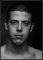
a very nice moody portrait, Martin...rare to see D without a smile on her face. For the purposes of DP (whose opinions are not always congruent with the rest of the world) I can offer a little insight: the slight overexposure on the left of the photo won't go over all that well. DP tends to favour perfect exposure, despite the fact that overexposure can often benefit an image. The shadow cast by her head adds a bit of an off-centred feel to the image; DP tends to favour more balanced images. This isn't to say that DP voters are always right (in fact, often they're not), but since they are the masses we're pandering to in these challenges it's worth paying attention to.

For my own personal opinion (DP aside), I like her off-centred, and i like that her face leads my eye to the centre of the photo. The pose and expression are great, and there's a real connection to the viewer. As for the crop, I'd prefer it be either a bit tigher OR a bit looser - as it is, the top of the image acts as a bit of a ceiling and closes the image in a bit, making her head look a little elongated. a tight crop that cuts off the top of her head or a looser one that adds some context might even out the perspective a little.

Overall a solid photo and a good entry. nice contrast and sharp focus on the right parts. well done, M.

P
  Photographer found comment helpful.
01/14/2007 12:24:18 AM
I really like the framing and the background. The left side of her face seems a bit overexposed.
  Photographer found comment helpful.
01/12/2007 03:01:39 PM
Spooky ... nice crop ... focus a tad on the soft side ... 7
  Photographer found comment helpful.
01/11/2007 07:44:23 PM
Way too harsh of lighting. I don't like the blown out face nor the heavy shadow it cast.
  Photographer found comment helpful.
01/11/2007 03:57:44 PM
i think that the light is a little bit distracting.. or not?
  Photographer found comment helpful.
01/11/2007 10:08:50 AM
Very nice portrait. My suggestion is to crop some empty space to the left
  Photographer found comment helpful.


Home - Challenges - Community - League - Photos - Cameras - Lenses - Learn - Prints! - Help - Terms of Use - Privacy - Top ^
DPChallenge, and website content and design, Copyright © 2001-2024 Challenging Technologies, LLC.
All digital photo copyrights belong to the photographers and may not be used without permission.
Current Server Time: 04/25/2024 12:35:56 AM EDT.