| Author | Thread |
Comments Made During the Challenge  |
|
|
11/11/2003 10:55:19 PM |
|
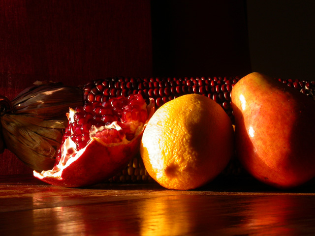
You certainly did capture the color and tone of the old masters. A little too bright on the orange or this would have been 10 for me |
|
 Photographer found comment helpful. Photographer found comment helpful. |
|
|
11/11/2003 08:05:07 PM |
|
Very nice but IMO needs to be sharper |
|
|
|
11/11/2003 03:00:00 PM |
|
nice. love the vibrant colors and the harsh lighting. can see this as a oil painting. the crop is a bit tight though. |
|
|
|
11/10/2003 07:54:16 PM |
|
I like the objects you chose, especially the opened pomegranate. But I think the arrangement is somewhat lacking. I think it would be better if more of the corn was visible and if there were more than 2 levels (the fruit and the corn). Perhaps moving the pomegranate in front of the other fruit would help in both respects. |
|
| Photographer found comment helpful. |
|
|
11/10/2003 07:43:19 PM |
|
You have such a grasp of color in this picture that I could kiss you. Thank you for restoring my faith in color, in texture (there's something about fruit on a wood table that's timeless, no?), and in the potential of photographers on this site to capture such design elements. |
|
| Photographer found comment helpful. |
|
|
11/10/2003 11:53:52 AM |
|
Lighting and colour is good, somehow the composition seems too flat. |
|
| Photographer found comment helpful. |
|
|
11/08/2003 12:38:08 PM |
|
theres some great tones here, and is a lovely composition. The only criticism I'd have is that the lighting is a little harsh on the lemon. 8 |
|
|
|
11/07/2003 09:14:59 PM |
|
Lovely colors and lighting. |
|
|
|
11/07/2003 07:55:57 PM |
|
nice...like the contrast and colors |
|
|
|
11/06/2003 10:49:22 PM |
|
Nice concept but maybe a bit dark. Can't make out the object to left of pomagranite. |
|
|
|
11/06/2003 03:59:30 PM |
This composition is a little 'flat' for lack of a better term. The lighting is good but you are over exposed in the highlights! I think that if you moved the camera up from the table some you would get a little more depth and more impact! I do really like the reflections on the table top itself!
TC |
|
| Photographer found comment helpful. |
|
|
11/05/2003 06:07:41 PM |
|
harsh lighting. lemon got overexposed... making the lighting more even and diffused would help. might also find a different way to arrange them so that they arent all laying in a straight line across the center of the frame. |
|
| Photographer found comment helpful. |
|
|
11/05/2003 11:13:46 AM |
|
I like the composition, but it's way overexposed (mostly the lemon). I think this could have been corrected by using more ambient light from the room in which the shot was taken. |
|
| Photographer found comment helpful. |
|
|
11/05/2003 09:28:43 AM |
|
I really enjoy your angle here! The lighting and composition is quite good! |
|
| Photographer found comment helpful. |
Home -
Challenges -
Community -
League -
Photos -
Cameras -
Lenses -
Learn -
Help -
Terms of Use -
Privacy -
Top ^
DPChallenge, and website content and design, Copyright © 2001-2026 Challenging Technologies, LLC.
All digital photo copyrights belong to the photographers and may not be used without permission.
Current Server Time: 06/28/2026 12:10:17 AM EDT.