Author Thread Comments Made During the Challenge
Post actions
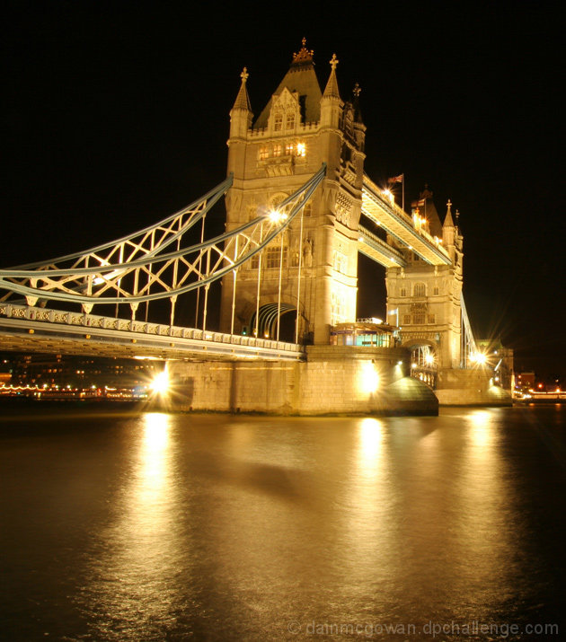
i have to imagine that you're getting tons of comments about the tilt...
Post actions
The focus is really bad in this shot and so is the yellow color, and to top it all it´s tilted aswell
Post actions
Lost alot of color with the long exposure, the exposure is nice, I would try to get some of the color back though.
Post actions
Seems to be just a tad blown out re the reflective lights...
Post actions
hey ... it looks like it's gonna fall down ! :-), not sharp enough also
Post actions
Post actions
this i a very photographed icon, hugely popular...while the tones and colours are nice, it's really quite a boring rendition of a famous place...sorry :-(
Post actions
this is too titled for me. Also the colour cast looks wrong. 5
Post actions
the perspective is slightly off. rotating anticlockwise stop it from looking like it will fall over.good detail thoughout.
Post actions
looks somewhat lop-sided, and the lights are a little blown out
Post actions
Post actions
I love the golden colour in this, very very nice. 8






 Add photograph to your favorites
 Add photographer to your favorites


 Photographer found comment helpful.


