| Author | Thread |
Comments Made During the Challenge  |
|
|
01/15/2007 09:19:44 PM |
|
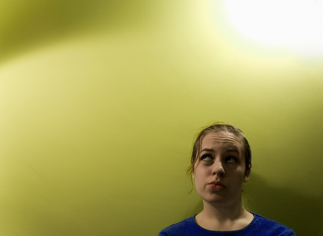
would like to see the face better illuminated. |
|
 Photographer found comment helpful. Photographer found comment helpful. |
|
|
01/12/2007 04:42:57 AM |
|
Lighting isn't my favourite. I know you were probably going for the blown out highlights on top (reminds me of one of those idea lightbulbs popping up over someone's head), but the lighting on the face seems too dark. You could have cropped off the left half though - it doesn't really add to the image. |
|
| Photographer found comment helpful. |
|
|
01/11/2007 09:39:11 PM |
|
I like the colors and the range of values you got in the background. I also like that the model is on the "light" side gazing over toward the "dark" side. Simple and elegant and cute. I would like to see the model be a little bigger in the frame, maybe. 6. |
|
| Photographer found comment helpful. |
|
|
01/10/2007 08:17:42 PM |
|
would have been nice ot have some light in her eyes |
|
| Photographer found comment helpful. |
|
|
01/10/2007 05:36:54 PM |
|
Like the idea - a tad more light on the model's left hand side perhaps, just to lift the shadows a bit? |
|
| Photographer found comment helpful. |
|
|
01/10/2007 08:54:16 AM |
|
| Photographer found comment helpful. |
|
|
01/10/2007 06:57:54 AM |
|
love this compositionally, but more light on her face would really make this shine |
|
| Photographer found comment helpful. |
Home -
Challenges -
Community -
League -
Photos -
Cameras -
Lenses -
Learn -
Help -
Terms of Use -
Privacy -
Top ^
DPChallenge, and website content and design, Copyright © 2001-2026 Challenging Technologies, LLC.
All digital photo copyrights belong to the photographers and may not be used without permission.
Current Server Time: 06/28/2026 05:53:31 AM EDT.