| Author | Thread |
|
|
01/23/2007 01:04:18 PM |
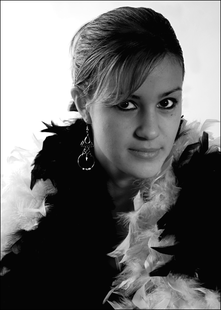
Interestingly, I find the contrast to be too high. (yup) The boa shadows are too dark, or way too white - loss of major detail here.
The problem appears to be the placement and intensity of the rear light, causing blowouts on the left and not enough dynamic range in the front.
Yes, your wife's eye liner is way too thick in this, giving her hollow eyes (post processing?)
Most if not all of the image could have benefited from a single additional over the head ( toward front ) light that allowed you to properly expose the face while not having to blow out that left side area.
Overall, tho, lighting aside - very nice image, composure, model and pose. |
|
 Photographer found comment helpful. Photographer found comment helpful. |
|
|
01/23/2007 12:42:56 PM |
|
I too find the contrast too jarring. I also find (I hope not to insult) that your model has too much eye makeup on. I do not think it suits her already elegant and pretty face. |
|
| Photographer found comment helpful. |
|
|
01/23/2007 12:30:11 PM |
|
It's definitely not a bad shot by any means. I too think the contrast is a little too high, especially evident on her shoulder on the left side. I think also that this shot may have scored better with a closer crop, less background and less along the bottom. Finally, there also seems to be some markings in the top right corner - not sure if it's from post-processing or actual shadows on your background. |
|
| Photographer found comment helpful. |
|
|
01/23/2007 12:21:49 PM |
|
This is a lovely portrait. The composition is very nice. The reason I think it may have not scored better would be the lighting on her face. Her face looks a bit dark, but the background looks a bit too light. It's a bit too contrasty. It's a lovely shot, but maybe could use just a bit more light on her face. :) |
|
| Photographer found comment helpful. |
Comments Made During the Challenge  |
|
|
01/11/2007 03:17:55 PM |
This picture is really good, I really like the composition.
I find the contrast to be a little too high. A lot of details are lost in the feathers, earring, and hair (in front).
I would have liked to see the face lighter (to be less grey), but it still gives it a mood, so I guess it depends on the style you are looking for in this picture.
Good job! |
|
| Photographer found comment helpful. |
|
|
01/10/2007 10:16:57 AM |
|
| Photographer found comment helpful. |
Home -
Challenges -
Community -
League -
Photos -
Cameras -
Lenses -
Learn -
Help -
Terms of Use -
Privacy -
Top ^
DPChallenge, and website content and design, Copyright © 2001-2026 Challenging Technologies, LLC.
All digital photo copyrights belong to the photographers and may not be used without permission.
Current Server Time: 06/29/2026 12:39:17 AM EDT.