| Author | Thread |
Comments Made During the Challenge  |
|
|
11/11/2003 07:57:04 PM |
|
Cool picture! I like the due tones, brings up child hood memorys ;) |
|
|
|
11/11/2003 05:39:28 PM |
|
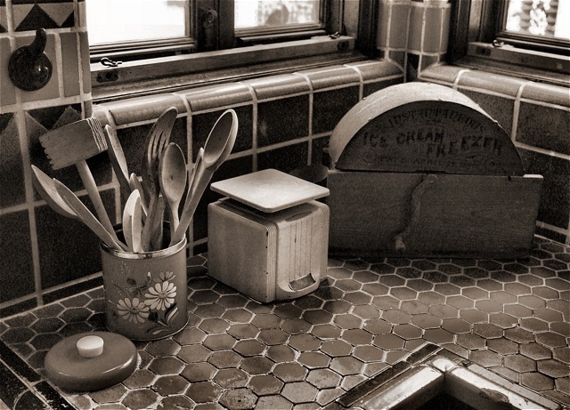
Nice depiction of the space, well lit. I like the gritty texture and the range of grays. I find the windows in the back distracting tho, and also the edge of the counter . Perhaps a little rearranging would make a more powerful image? |
|
|
|
11/11/2003 04:33:17 AM |
|
Awesome. You capture the working-class kitchen of the 60s here. Go in a little closer--don't be afraid to take a new angle or zoom in on a particularly interesting feature. The best stories involve specific details rather than a huge generalization. Such is true for the best photography. There's plenty of time in life to tackle all the objects pictured here; your job is to convince me that they all belong there together. If not, zoom in--get more specific. |
|
|
|
11/07/2003 04:13:28 AM |
|
 Photographer found comment helpful. Photographer found comment helpful. |
|
|
11/06/2003 05:37:26 PM |
|
Excellent. Nice shot in all ways, |
|
|
|
11/06/2003 01:07:38 AM |
|
There are some interesting objects but nothing stands out as THE subject. It's become somewhat crowded with no focal point. Lots of potential here though. |
|
| Photographer found comment helpful. |
|
|
11/05/2003 02:41:50 PM |
|
Very well done. The corner of the counter in the bottom right is a little distracting, but not bad. I like the choice of subject and color tone. |
|
| Photographer found comment helpful. |
|
|
11/05/2003 11:57:30 AM |
|
Beautiful lighting and masterful exposure. Just the right amount of contrast. Great textures. My only dislike are the burnt out highlights caused by the windows. I'd like to have seen a very similar shot without the windows. 7 |
|
| Photographer found comment helpful. |
|
|
11/05/2003 08:34:54 AM |
|
Very nice picture, I like this. |
|
| Photographer found comment helpful. |
|
|
11/05/2003 02:34:48 AM |
|
Nice composition and the sepia (I think) is a nice touch. |
|
| Photographer found comment helpful. |
Home -
Challenges -
Community -
League -
Photos -
Cameras -
Lenses -
Learn -
Help -
Terms of Use -
Privacy -
Top ^
DPChallenge, and website content and design, Copyright © 2001-2026 Challenging Technologies, LLC.
All digital photo copyrights belong to the photographers and may not be used without permission.
Current Server Time: 06/28/2026 06:02:30 AM EDT.