| Author | Thread |
Comments Made During the Challenge  |
|
|
01/24/2007 11:47:03 PM |
|
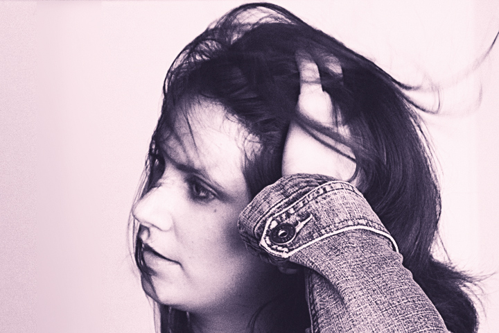
i have an idea as to what your after, but am having a hard time connecting with the image. |
|
 Photographer found comment helpful. Photographer found comment helpful. |
|
|
01/18/2007 03:27:54 AM |
|
Not focused right. B+W tone too bizarre. Her expression is perplexing. Perhaps too personal. |
|
| Photographer found comment helpful. |
|
|
01/16/2007 12:43:38 AM |
|
Not that keen on the post processing of this one... |
|
| Photographer found comment helpful. |
|
|
01/14/2007 10:15:03 AM |
|
good concept but composition is not good and the pink cast does not fits here, pure B&W with this grain + better composition would make this photo much more exiting |
|
| Photographer found comment helpful. |
|
|
01/13/2007 12:31:42 AM |
|
| Photographer found comment helpful. |
|
|
01/12/2007 09:17:01 PM |
|
I like the movement, but maybe cropping less off the bottom to get the line of the arm better might improve the composition. |
|
| Photographer found comment helpful. |
|
|
01/12/2007 07:50:04 PM |
|
I gave this a 6. a better composition and some background could push this over the top into 7+ territory. 7+ means I would put it on my wall (if I had a space for it) |
|
| Photographer found comment helpful. |
|
|
01/12/2007 10:41:24 AM |
|
Image could be sharper. She is a bit too centered. Purple tones are nice. |
|
| Photographer found comment helpful. |
Home -
Challenges -
Community -
League -
Photos -
Cameras -
Lenses -
Learn -
Help -
Terms of Use -
Privacy -
Top ^
DPChallenge, and website content and design, Copyright © 2001-2026 Challenging Technologies, LLC.
All digital photo copyrights belong to the photographers and may not be used without permission.
Current Server Time: 06/30/2026 01:50:18 AM EDT.