| Author | Thread |
Comments Made During the Challenge  |
|
|
01/09/2007 12:32:05 PM |
|
 Photographer found comment helpful. Photographer found comment helpful. |
|
|
01/09/2007 12:22:47 PM |
|
nice going for something different than the regular fence |
|
| Photographer found comment helpful. |
|
|
01/07/2007 09:57:32 AM |
|
I love it. very refreshing after tons of rustical fences |
|
| Photographer found comment helpful. |
|
|
01/06/2007 01:33:55 PM |
|
oooooooooo... i like this one a lot... something creative too. good job. i don't think anyone else thought of this one.. awsome awsome! |
|
| Photographer found comment helpful. |
|
|
01/05/2007 04:18:10 PM |
|
Nice choice for the challenge - I like it. |
|
| Photographer found comment helpful. |
|
|
01/04/2007 10:29:10 PM |
|
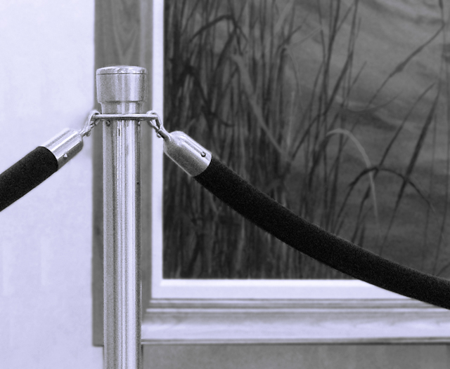
Simple is good but here, the composition doesn't work for you. The picture frame is directly behind the bar. When things are stacked directly on top of each other, visually, the eye is annoyed. |
|
| Photographer found comment helpful. |
|
|
01/04/2007 02:12:06 PM |
|
| Photographer found comment helpful. |
|
|
01/04/2007 08:43:39 AM |
|
Very interesting comp. I might have scooted the post over a little to the right, though (into the darkness of the background art piece). Desat works well. |
|
| Photographer found comment helpful. |
|
|
01/03/2007 11:41:28 PM |
|
I am giving you a high score for CREATIVITY!!! |
|
| Photographer found comment helpful. |
|
|
01/03/2007 11:25:58 PM |
|
Hmm, I don't really know if I would ever have thought to call this a fence, or even to say that this area is fenced off. |
|
| Photographer found comment helpful. |
|
|
01/03/2007 02:06:26 PM |
|
doesnt work for me...dont think it is a fence either |
|
| Photographer found comment helpful. |
|
|
01/03/2007 01:06:12 PM |
|
Subject matter here was not particularly interesting to me, and while suitably shot, there's nothing special or different about the appearance of objects with which we're all familiar. |
|
| Photographer found comment helpful. |
|
|
01/03/2007 12:49:49 PM |
|
pole should have been positioned slightly to the left of the background picture and against the plain wall. positioning it in front of the picture frame leads to a poor composition. |
|
| Photographer found comment helpful. |
|
|
01/03/2007 08:30:37 AM |
|
The post blends into the background to much. |
|
| Photographer found comment helpful. |
Home -
Challenges -
Community -
League -
Photos -
Cameras -
Lenses -
Learn -
Help -
Terms of Use -
Privacy -
Top ^
DPChallenge, and website content and design, Copyright © 2001-2026 Challenging Technologies, LLC.
All digital photo copyrights belong to the photographers and may not be used without permission.
Current Server Time: 07/16/2026 04:26:22 PM EDT.