| Author | Thread |
|
|
01/15/2007 07:05:54 PM |
|
You're quite the anti-fashionista. I think I am going to become a fan... ;-) |
|
 Photographer found comment helpful. Photographer found comment helpful. |
|
|
01/15/2007 01:34:16 AM |
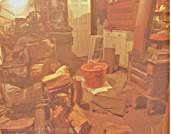
I called it! I gave you a 10 just to mix it up. :) Cheers mate.
edit..
This is kind of how I feel about my basement sometimes. It is spectacularly more tidy than yours, but still feels cluttered because it is used as a catchall.
Message edited by author 2007-01-15 14:24:05. |
|
| Photographer found comment helpful. |
Comments Made During the Challenge  |
|
|
01/14/2007 10:36:45 PM |
|
I do not care for the PP personally.....good example, though. |
|
| Photographer found comment helpful. |
|
|
01/14/2007 09:07:57 PM |
|
for my monitor the contrast is too high, but it meets the challenge |
|
| Photographer found comment helpful. |
|
|
01/14/2007 08:31:16 PM |
|
the coloring of this does nothing to help it. |
|
| Photographer found comment helpful. |
|
|
01/14/2007 07:52:18 PM |
|
the light in this one isn't right at all. |
|
| Photographer found comment helpful. |
|
|
01/14/2007 10:37:19 AM |
|
I like the idea and the treatment generally, but to me it seems a bit too much. I think it could have had more impact if the treatment was pulled back a bit. |
|
| Photographer found comment helpful. |
|
|
01/14/2007 12:22:34 AM |
|
Great idea but the post edit is not working for me. |
|
| Photographer found comment helpful. |
|
|
01/13/2007 02:05:31 AM |
|
This has whiterook written all over it. I'd offer my opinion of the pic but i'll just agree with the rest of your commentators. It is shockingly messy! |
|
| Photographer found comment helpful. |
|
|
01/11/2007 11:05:37 PM |
|
I think I know who took this... is it another instant classic by White Rook? excellent 'dusty' appearance for the basement photo. |
|
| Photographer found comment helpful. |
|
|
01/11/2007 04:31:14 PM |
|
Leave all as it is, but get a better camera or improve lighting - the noise and colour are really strange |
|
| Photographer found comment helpful. |
|
|
01/11/2007 03:35:37 PM |
|
I'm really not sure about this effect. I mean it makes it look dusty and that, but is kinda strange looking. |
|
| Photographer found comment helpful. |
|
|
01/11/2007 02:55:20 PM |
|
Could have been a very good picture for this challenge - but apparently you decided to ruin it... |
|
| Photographer found comment helpful. |
|
|
01/11/2007 10:25:31 AM |
|
the graininess may be the point to make it look worse, but I really don't like this treatment for the photo |
|
| Photographer found comment helpful. |
|
|
01/11/2007 08:39:44 AM |
|
The lighting on this shot really needs to be adjusted. I don't know if it was done for effect, but the grainyness really isn't needed on this shot. |
|
| Photographer found comment helpful. |
|
|
01/10/2007 02:02:23 PM |
|
My garage looks like this! |
|
| Photographer found comment helpful. |
|
|
01/10/2007 06:41:48 AM |
|
Quite dreadful - so over lightened with no depth of blacks whatsoever. Add in the white bar image right and this just seems like a joke. |
|
| Photographer found comment helpful. |
|
|
01/09/2007 02:32:54 PM |
|
Very noise and the light looks weird here. |
|
| Photographer found comment helpful. |
|
|
01/09/2007 01:55:33 PM |
|
To my eyes, there isn't a whole lot to redeem this image. The scene is not particularily attractive, the composition is centred and without much charm, the colours are very muted, and there's a lot of noise. ~2 |
|
| Photographer found comment helpful. |
|
|
01/09/2007 01:55:08 PM |
|
| Photographer found comment helpful. |
|
|
01/09/2007 08:01:56 AM |
|
noisy, overexposed. but nice idea :) |
|
| Photographer found comment helpful. |
|
|
01/09/2007 04:45:42 AM |
|
nice idea... less nice realisation |
|
| Photographer found comment helpful. |
|
|
01/08/2007 11:34:59 PM |
|
Don't understand the lack of color or contrast ... is that intentional? |
|
| Photographer found comment helpful. |
|
|
01/08/2007 10:20:08 PM |
|
personally, I don't care for the processing here ... |
|
| Photographer found comment helpful. |
|
|
01/08/2007 05:38:45 PM |
|
The lighting of this image is very unattractive to me. It feels as though it's a low-res scanned Poloroid that was cropped too wide(hence the white strip on the right of the image). I think some darkening and contrast, maybe some noise removal, could have really salvaged this image. |
|
| Photographer found comment helpful. |
|
|
01/08/2007 05:07:56 PM |
|
I can see the noise and grain might be adding to the atmosphere, but it doesn't work for me. |
|
| Photographer found comment helpful. |
|
|
01/08/2007 03:32:12 PM |
|
| Photographer found comment helpful. |
|
|
01/08/2007 12:37:11 PM |
|
Ouch! The quality of this picture is really suffering! |
|
| Photographer found comment helpful. |
|
|
01/08/2007 12:06:55 PM |
|
I don't care for the overall editing effect used. |
|
| Photographer found comment helpful. |
|
|
01/08/2007 09:50:16 AM |
|
Not sure why it was over processed.... but good idea for the challenge |
|
| Photographer found comment helpful. |
|
|
01/08/2007 01:27:43 AM |
|
looks like my room, but quality+lighting+focus+composition brings my vote down |
|
| Photographer found comment helpful. |
|
|
01/08/2007 01:14:40 AM |
|
Whoa not good sorry but does meet challenge |
|
| Photographer found comment helpful. |
|
|
01/08/2007 01:02:13 AM |
|
Okay, I get the connection to the challenge. But the image is really washed out. |
|
| Photographer found comment helpful. |
|
|
01/08/2007 12:40:50 AM |
|
the edit is horrible...washed out and poor ... sorry :-( |
|
| Photographer found comment helpful. |
Home -
Challenges -
Community -
League -
Photos -
Cameras -
Lenses -
Learn -
Help -
Terms of Use -
Privacy -
Top ^
DPChallenge, and website content and design, Copyright © 2001-2026 Challenging Technologies, LLC.
All digital photo copyrights belong to the photographers and may not be used without permission.
Current Server Time: 06/28/2026 03:53:16 AM EDT.