| Author | Thread |
|
|
01/24/2007 09:35:13 PM |
|
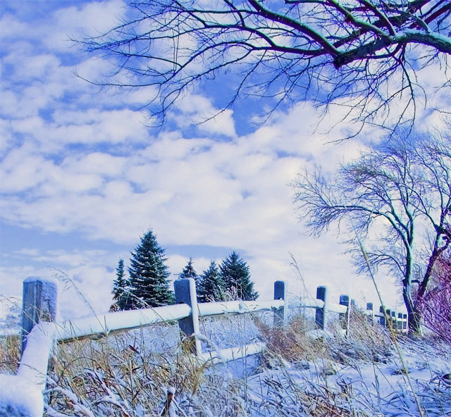
This one has wonderful composition, which I think is it's strong point. The angle of the fence, the forground grasses and the trees in the background all work together well. The tones and brightness are very distracting to me. I would like to see this one re-editing for a more subtle, less blue effect and some darker tones. |
|
 Photographer found comment helpful. Photographer found comment helpful. |
|
|
01/24/2007 08:48:38 PM |
This looks very washed out or over exposed. a lot of detail had been lost in the lighter areas. It's also too blue overall. Which works for some photographers on this site but is hard to pull off. I think when going with overall blues you want Darkers blue tones, the lighter ones aren't as asthetically pleasing.
HTH
|
|
| Photographer found comment helpful. |
Comments Made During the Challenge  |
|
|
01/09/2007 11:22:36 PM |
|
|
|
01/09/2007 12:33:44 PM |
|
I'm not sure what to make of this one. It lacks any deep colours, which gives it a weird look almost like a painting. On the other hand, I really like the way that looks. 7. |
|
| Photographer found comment helpful. |
|
|
01/09/2007 12:15:59 PM |
|
This looks fake, but nice like a back dorp in a play |
|
| Photographer found comment helpful. |
|
|
01/09/2007 11:28:17 AM |
|
|
|
01/08/2007 04:28:36 PM |
|
Maybe just a little heavy toward the blue, but very cold feeling, and, yet, still some warmth, too. Good shot. |
|
| Photographer found comment helpful. |
|
|
01/08/2007 11:05:36 AM |
|
I think this is very pretty! I don't like the purple colored tree that is poking out on the right. Crop it out and it would be better. |
|
| Photographer found comment helpful. |
|
|
01/08/2007 03:31:40 AM |
|
Great colors... The trees are in the best spots with a great view of the fence going out into the distance.. |
|
| Photographer found comment helpful. |
|
|
01/07/2007 11:18:57 PM |
|
| Photographer found comment helpful. |
|
|
01/07/2007 11:10:18 PM |
|
Overdone PP i guess. I dont like the overpowering blue tint to the whole image |
|
| Photographer found comment helpful. |
|
|
01/06/2007 11:32:11 PM |
Way over saturated... and what was potentially a good image is ruined. You might consider looking at future images on different monitors, since it could be that your monitor is not calibrated properly.
Don't give up the ship... you do have a good eye. |
|
| Photographer found comment helpful. |
|
|
01/06/2007 04:16:34 PM |
|
Almost looks like a painting, looks great! |
|
| Photographer found comment helpful. |
|
|
01/06/2007 02:06:09 PM |
|
Nice picture but I dislike the colors, sorry about that, there´s something wrong with the balance between cyan and magenta (or red and blue), I´ll give you 4 for a good choice of location. good luck |
|
| Photographer found comment helpful. |
|
|
01/05/2007 05:08:33 PM |
|
While I'm not entirely a fan of the processing, I do have to say it gives this a cold but magical look. So in this case, the more I look at it, the more I think I like it. |
|
| Photographer found comment helpful. |
|
|
01/05/2007 04:12:36 PM |
|
| Photographer found comment helpful. |
|
|
01/04/2007 04:32:58 PM |
|
I like it but that red on the right and on top takes me out of it |
|
| Photographer found comment helpful. |
|
|
01/04/2007 02:52:34 AM |
|
interesting use of... whatever you did! |
|
| Photographer found comment helpful. |
|
|
01/04/2007 12:28:58 AM |
|
This looks way too bright for me. |
|
| Photographer found comment helpful. |
|
|
01/03/2007 07:03:53 PM |
|
A super composition, but I am really not keen on the blue colour caste (not sure if this is a white balance issue or a deliberate postprocessing decision, but either way, doesn't work for me). None the less, a 6. |
|
| Photographer found comment helpful. |
|
|
01/03/2007 05:16:14 PM |
|
too blue....otherwise, nice |
|
| Photographer found comment helpful. |
|
|
01/03/2007 01:03:56 PM |
|
The blue overtones to everything here did not work for me; was the snow really blue to the naked eye? Was the tree/bush on the right really purple? The pastel effect was just a bit too much for me to take. |
|
| Photographer found comment helpful. |
|
|
01/03/2007 12:54:06 PM |
|
Nice scene but something weird going on with the colour, too blue/purple. |
|
| Photographer found comment helpful. |
|
|
01/03/2007 10:45:26 AM |
|
this beautiful landscape with nice composition with a little less blue would have earned a couple of extra points from me for sure. |
|
| Photographer found comment helpful. |
|
|
01/03/2007 09:18:04 AM |
|
edited badly but the photograph itself is well taken, framed and the perspective is great... still get a 6 from me |
|
| Photographer found comment helpful. |
|
|
01/03/2007 02:07:08 AM |
|
it doesn't need quite so much blue tint, but still nice |
|
| Photographer found comment helpful. |
Home -
Challenges -
Community -
League -
Photos -
Cameras -
Lenses -
Learn -
Help -
Terms of Use -
Privacy -
Top ^
DPChallenge, and website content and design, Copyright © 2001-2026 Challenging Technologies, LLC.
All digital photo copyrights belong to the photographers and may not be used without permission.
Current Server Time: 06/27/2026 12:13:44 PM EDT.