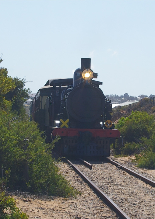
You received several comments during the challenge that point out that your image looks flat, washed out, etc. Adding contrast and saturation would help considerably. Not knowing what post processing software you are using, it is a bit hard to walk you through the steps to help this image. Many programs offer an autofix or autobalance option that would help some. If you are using a program with Levels or Curves, I would be more than happy to tweak your image and provide the steps taken to get there. Just send me a PM with your software type and we can start working on it.
One thing you can do on your own with this image to strengthen it is to crop it differently to see how the composition (look and feel of the image) changes. Since the sky has no real features that are interesting, it would help to minimize the sky as much as possible. As is, it is just dead space that adds nothing to the image composition. I would also suggest cropping the left side of the image to remove a significant amount of the bush. As is, it is as tall as the train and fights for the attention of the viewer. An added benefit of cropping off some of the left side is that the train will appear more to be moving through your image from the left to the right. With the train centered in the composition, it feels like it is parked.
Feel free to PM me if you have any questions regarding this critique.
You in no way irritate me with your comments. They are very handy to read. Like my website (located in my profile) says I'm a beginner that wishes to learn. I have some equipment with the entry level Pentax *IST DL Entry-Level DSLR. Please comment on my others if you like. I wish to learn as much as possible. Also the tutorials on this site are very good and I'm learning quite a lot. Short term goal is to have a picture that gets a score above six. My procrastination shot is currently at 5.3. I' very happy with that one.
Just using a polarizer would have made the colors much richer, the sky darker, and the haze much less in this image.
You may have tripped the shutter just a little too soon. I feel that the image would have more interest if more of the side of the engine was in it.
As you indicate, it's a "grab" shot, and not a thought out set up.
Flat black things like the front of the boiler are very tricky to expose so that you get any detail, because they suck up so much light that you have to overexpose everything else to get good detail in the black.
I see that many of the other comments key in on post processing, but the best thing is to get the image near right to start with when the shutter clicks. That takes experience, and will come if you keep using the camera, and thinking about how to best capture the moment that you want. I hope that I do not irritate you with honest comments. Keep clicking.
I like the shot, but I think you would benefit from a little more contrast. If you are using an editing application that supports curves you can control the contrast across the train engine without your highlight getting blown out. Good work and thanks for sharing.






 Add photograph to your favorites
 Add photographer to your favorites

 Photographer found comment helpful.


