| Author | Thread |
|
|
01/08/2007 04:49:24 PM |
|
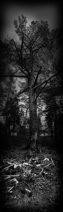
This is a bummer it got a low score, I gave it a 7 I liked it alot. I like the long image and the black & white works good. I think it would make a good scary movie poster. (I like the lighting, and I don't think it is too dark, more just right) |
|
 Photographer found comment helpful. Photographer found comment helpful. |
|
|
01/05/2007 03:24:43 PM |
|
I had a lot of trouble seeing this image on my monitor. I couldn't see the whole thing at once without copying it and viewing it in Windows Picture Viewer at a reduced size. Either way, on DPC or in Windows, I couldn't see it well enough to tell about the focus. I think I would like it a lot if I saw a very large print on a large gallery wall. |
|
| Photographer found comment helpful. |
Comments Made During the Challenge  |
|
|
01/04/2007 04:47:21 PM |
|
Great perspective of the tree, love the vignetting also it really brings your attention to what you were focusing on. Nice work. |
|
| Photographer found comment helpful. |
|
|
01/04/2007 12:51:02 AM |
|
I would prefer to see a little more on the sides. JMHO though. |
|
| Photographer found comment helpful. |
|
|
01/02/2007 05:12:04 PM |
|
Couldn't really see this. |
|
| Photographer found comment helpful. |
|
|
01/02/2007 12:27:21 PM |
|
the photo is cropped too small and it's too dark |
|
| Photographer found comment helpful. |
|
|
12/31/2006 09:18:03 PM |
|
don't really like the crop |
|
| Photographer found comment helpful. |
|
|
12/31/2006 07:57:58 PM |
This is actually quite nice but I'm put off by the extremely tight crop in this forum. As a specialty sized print say 8 inches tall by whatever the width would be, this would probably work very nicely. Sometimes you gotta keep in mind the dimensions that we have to work with when entering the challenges.
TC
PS: I'm bumping it up slightly from my original gut instinct score... |
|
| Photographer found comment helpful. |
|
|
12/30/2006 12:04:42 AM |
|
Wow...are you sure that's not 721 pixels high? It's kinda tall. Oh, and narrow too. Different...good luck to ya! |
|
| Photographer found comment helpful. |
|
|
12/29/2006 04:51:29 PM |
|
very nice. could it use a little more contrast between your white and black extreems? |
|
| Photographer found comment helpful. |
|
|
12/29/2006 01:57:30 PM |
|
| Photographer found comment helpful. |
|
|
12/29/2006 01:22:54 PM |
|
I really wish this shot was a tad wider and I could really see the bones. This photo looks like it had a lot of potentials, just too narrow. |
|
| Photographer found comment helpful. |
|
|
12/29/2006 10:04:59 AM |
|
Not enough pixels to tell what we are seeing in the foreground. |
|
| Photographer found comment helpful. |
|
|
12/29/2006 07:57:13 AM |
I'm just going to go right out and say it: these extremely long thin images just don't work for me in a challenge situation: after paging through images that fill the page with big bold beautiful pictures, a long skinny, is a shock to the system which has been mesmerised up to that point. Now suddenly I've got to lean in close to the screen and scroll up and down because I can only see part of the image at a time, and so ultimately I get to see an image about 1/8 the size of the rest.
Having said that: I think your subject and composition are brilliant...if this had been a large square image it would have had so much impact. |
|
| Photographer found comment helpful. |
|
|
12/29/2006 05:02:56 AM |
Very chilling.
I like the perspective and style here. Shame the dodging and burning seems a little unevenly patchy. |
|
| Photographer found comment helpful. |
|
|
12/29/2006 12:45:29 AM |
|
I bet this would look phenomenal in BIG print like 2-3 meters high up on a wall but presented like this, in small websize resolution it just doesn´t work for me as dramatically as it might up on a wall. Courageous effort though, two thumbs up for that. |
|
| Photographer found comment helpful. |
Home -
Challenges -
Community -
League -
Photos -
Cameras -
Lenses -
Learn -
Help -
Terms of Use -
Privacy -
Top ^
DPChallenge, and website content and design, Copyright © 2001-2026 Challenging Technologies, LLC.
All digital photo copyrights belong to the photographers and may not be used without permission.
Current Server Time: 06/28/2026 05:58:17 PM EDT.