| Author | Thread |
Comments Made During the Challenge  |
|
|
01/02/2007 11:28:58 AM |
|
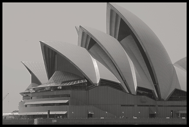
perhaps a tighte crop would have been more intersting |
|
 Photographer found comment helpful. Photographer found comment helpful. |
|
|
12/31/2006 10:42:50 PM |
|
would have liked more contrast |
|
| Photographer found comment helpful. |
|
|
12/31/2006 09:19:35 PM |
|
| Photographer found comment helpful. |
|
|
12/29/2006 02:48:17 AM |
|
I like the composition, but overall it could probably use a bit more contrast. |
|
| Photographer found comment helpful. |
|
|
12/28/2006 03:58:07 PM |
|
Perhaps because I have seen so many other great photos of this building (and therefore and am comparing)or because the images appears dull because of the bw/gray aspects of it, or because I want to see the pattern of the vertical lines on the side of the building as well, or because you have cut off the top of the largest sail with your border, or because the little crane on the left is distracting, I find this picture to be just "average." |
|
| Photographer found comment helpful. |
|
|
12/28/2006 07:06:06 AM |
this could be a very good image, but the b/w conversion is a bit flat. a wider tonal range would serve this well - having a tue blacka nd a true white in the range, rather than just the mid-greys, wuold really make the pic pop.
a good composition. keep shooting! |
|
| Photographer found comment helpful. |
|
|
12/27/2006 01:21:33 PM |
|
could use more contrast in the tones maybe |
|
| Photographer found comment helpful. |
|
|
12/27/2006 12:10:50 PM |
|
Beautiful pattern, but the photo is lacking contrast, and focus, and the tallest "sail" is cut off on the top. |
|
| Photographer found comment helpful. |
|
|
12/27/2006 11:41:41 AM |
|
Very poor contrast. Your cropping allowed a crane on the left and left out something more interesting on the right side. As well it cut the top of the highest structure. |
|
| Photographer found comment helpful. |
|
|
12/27/2006 08:51:05 AM |
|
I miss the upper part of the building and the gray shade doesn't please me... |
|
| Photographer found comment helpful. |
|
|
12/27/2006 03:16:00 AM |
|
I think you could make this photo stand out quite a bit more if you made some adjustments to the levels. Also, the building is cut off at the top. |
|
| Photographer found comment helpful. |
|
|
12/27/2006 01:53:05 AM |
|
I love the Sydney opera house and the textures on the outside are amazing... good capture! |
|
| Photographer found comment helpful. |
|
|
12/27/2006 01:41:18 AM |
|
| Photographer found comment helpful. |
|
|
12/27/2006 01:04:07 AM |
|
IMHO, this image is very flat and needs more contrast. |
|
| Photographer found comment helpful. |
|
|
12/27/2006 12:48:51 AM |
|
The sydney building looks squashed. Maybe leave some room on top and sides? |
|
| Photographer found comment helpful. |
|
|
12/27/2006 12:24:18 AM |
|
The lack of contrast and overall dullness unfortunately makes this one of the least interesting shots I have seen of this very interesting building. |
|
Home -
Challenges -
Community -
League -
Photos -
Cameras -
Lenses -
Learn -
Help -
Terms of Use -
Privacy -
Top ^
DPChallenge, and website content and design, Copyright © 2001-2026 Challenging Technologies, LLC.
All digital photo copyrights belong to the photographers and may not be used without permission.
Current Server Time: 06/28/2026 04:29:51 AM EDT.