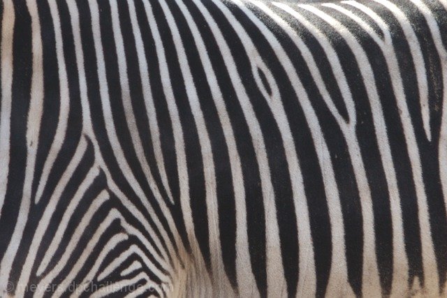
I think a slightly tighter crop, a conversion to black and white, and more contrast would have made this so much better. I did a photo similar to this by using those editing steps:
Try editing it like that and I'm sure it will look awesome :)
Increasing the contrast (or underexposing it a bit more) would make the stripes stick out more. Being mostly vertical is a bit less interesting. Try them on more of a diagonal (even if that is different from how they actually were on the zebra).






 Add photograph to your favorites
 Add photographer to your favorites


 Photographer found comment helpful.


