Greeting from the Critique Club and Happy New Year!
Composition:
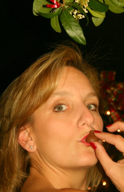
Great idea and I like the title. I would like to have seen a little more of the mistletoe at the top of the frame and more of a gap between the model and the mistletoe. The red 'ribbon' in the background is distracting and could do with being removed. I do like the pose but I may have liked to see slightly more of the hand or just the thumb and forefinger.
Technicals:
I definitely agree with your commenters, the lighting is a little harsh here. I am not an expert on portrait photography by far but one thing I have learnt is that (most of the time) the focus should be on the eyes and I certainly think in this instance you should have focussed on the eyes to give the viewer a more central focal point.
If you've got any questions about this critique, please feel free to contact me via the PM system.





 Add photograph to your favorites
 Add photographer to your favorites

 Photographer found comment helpful.


