| Author | Thread |
Comments Made During the Challenge  |
|
|
11/01/2003 08:49:15 PM |
|
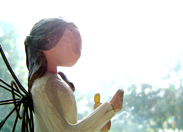
The placement of the angel, and the focus on the angel looks good, but the top right seems blown out. |
|
 Photographer found comment helpful. Photographer found comment helpful. |
|
|
11/01/2003 05:51:44 PM |
|
| Photographer found comment helpful. |
|
|
10/30/2003 09:57:06 AM |
didn't like the colour and contrast
a bit far-off too |
|
| Photographer found comment helpful. |
|
|
10/29/2003 02:18:18 PM |
|
The focus on the subject is good but I think the sky is a little to bright overall. |
|
| Photographer found comment helpful. |
|
|
10/29/2003 01:09:21 PM |
|
I did a shot kind of like this for urban landscapes. And by saying "like this" I mean I had the sky really blown out, but the foreground exposed correctly. It will be interesting to see if it does better than mine did. I do like this style, personally, and I think it gives your subject an almost holy glow. Nice composition. Hope it does better than mine being that it is being applied to a different subject in a different challenge. |
|
| Photographer found comment helpful. |
Home -
Challenges -
Community -
League -
Photos -
Cameras -
Lenses -
Learn -
Help -
Terms of Use -
Privacy -
Top ^
DPChallenge, and website content and design, Copyright © 2001-2026 Challenging Technologies, LLC.
All digital photo copyrights belong to the photographers and may not be used without permission.
Current Server Time: 06/28/2026 05:26:41 AM EDT.