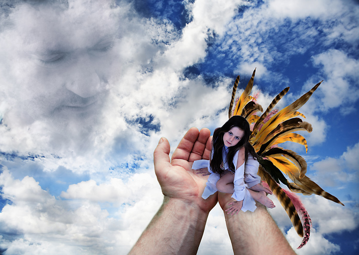
Okay, there are eight images in this creation. Each image was individualy cut out and then brought together with lots of fiddling and touching up. The wings were made using individual feathers and then brought onto the computer and created.
In total, over 65 layers, 7 groups, 1 hour of photography and about 4 hours of computer work. And there you have it.
Statistics
Place: 53 out of 123 Avg (all users): 6.0449 Avg (commenters): 7.4000 Avg (participants): 6.0455 Avg (non-participants): 6.0448 Views since voting: 1624 Views during voting: 738 Votes: 267 Comments: 34 Favorites: 2 (view)
Judi, I'll explain my 4. I just didn't like it very much. It's definitely "photographic in nature," despite being a composite. It's just too busy. I really like the face in the clouds, but the hands, well, I don't. My tastes run to more hidden compositing vs. obvious.
The rule set is pointless if the voters are going to vote down composites. As I mentioned on kiwiness' entry I'd love to see this rule set used on a non-landscape type challenge.
I like this image but I would have liked even better to see less elements in it. It isn't that I don't like this type of editing - I have nothing against the more heavily processed shots in this challenge. I know that it would totally change what you were going for but it might be neat to see just the girl in the sky all by herself. That is because I feel you have done SUCH a great job with the girl (pose, colors, the way it is edited to look very, very real) that I want to keep looking at her, and I just find myself distracted by the hands and the face in the clouds. I think that the girl is strong enough to hold the image on her own. Or maybe have the hands or the face in addition to the girl but not both. In any case, you did a good job with the editing - everything looks very natural. I am bumping you up a point for the strong technical aspect.
Now this is more of what I expected from this ruleset. The face in the clouds is what my eyes end up being drawn too. While evrything is edited pretty cool and looks great its the face that makes this image for me. Nice work Kita! ;)
Very creative. Nice job working with the new "Expert" rules. Definitly has the "WOW" factor working for it. Just can't figure out if it will finish 1st or 2nd:)
The angel looks wrong, why is the model not sliding up your arm, IMO, if she was just a little further into the palm of your hand, it would have been so much better, the idea is great, and I expect it will do very well, well done, and good luck
The fairy in the hands is so cute! I love the variety of feathers. The pose and expression are fantastic. The blue sky is a good contrast to the orange feathers. I don't think I would have included the face in the sky. But it does bring your attention back to the sky. However, I still feel the subject in this case is the fairy. Not the sky. Very creative and OOTB.
There just appears to be too much going on in this photo for my taste. I like the face, I like the hands, but the whole thing together doesn't work for me.
I like the idea of this. Looks a bit too contrived though. I can see the cut and paste a bit more than I'd like. Fun to extend the envelope though. I think maybe just the hands and face would have worked better for me.





 Add photograph to your favorites
 Add photographer to your favorites

 Photographer found comment helpful.


