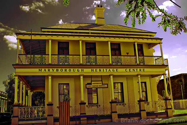
Thanks for all your comments, for those that tought it was tilted, the veranda above the buildding name is a perfect horizon with the top of the frame,the natural fall of the hill was brought in doing this, the shot was taken from a low position and raised to bring in the skyline creating the effect of the building protruding from the frame, the color cast was created using hue/sat and selective color to bring in the feel of the era, the tree in the top of the frame is deliberate for composition and distance framing. IMO this was creative photography, but it would seem voters could not see this, or believe there style should be seen in every photo.
Put a frame around this and hang it on the wall how would it stand out.
Preserving The Past
PhotoShop
Remove Parking sign
Via Layer masks
Levels
Hue/Sat
Selective color
Dodge& Burn
Brightness/Contrast
Crop
Quality Raw MG9093 CR2
Statistics
Place: 446 out of 501 Avg (all users): 4.9877 Avg (commenters): 4.1667 Avg (participants): 4.9065 Avg (non-participants): 5.1455 Views since voting: 936 Views during voting: 226 Votes: 162 Comments: 15 Favorites: 0
I think you have been hammered quite a lot with this image mate, and I can see where they are coming from, but I like the processing, as it give this a "historic aged" feeling to the image.
The slant is due to the hill which the building sits on.....but can see why others found this to be a little off putting.
Be proud of this image Brian, as I really like it, but I am somewhat biased, due to the fact, it is of my home town.....
Gee, the thumbnail is very strong in this image.....
My only suggestion is that I like to see its horizon not on the slant, but straight.....
I love the eerie effect that you have achieved with the processing, and again it is my home town, so I like that very much.....
Nice sharp image. One of my pet hates is images which slant. Why not either straighten in post processing or hold the camera straight in the first place.
Compositionally you also chopped off the front wall at the left.
From a competition perspective these are cardinal sins and would be marked down severley. In DPC it will get away with such errors, but you should be made aware to help you in your next submissions.
Difficult shot to assess - the strange light is quite interesting, but there's something strange going on in the sky, and cutting the bottom left corner of cthe building is an odd thing to do. Filling just one corner with foreground foliage is also a touch random - it can work, but generally requires more of a full frame around the image to not look like a mistake. In the end though, it's just a full front of a building, with, for me, not enough interest to make an impact: the strange colouring just seems like an attempt to win something back from an OK but not spectacular shot.






 Add photograph to your favorites
 Add photographer to your favorites

 Photographer found comment helpful.


