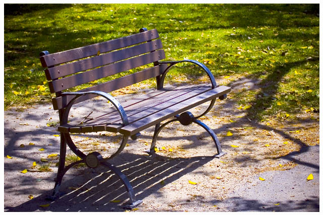
Although this has the beginnings of something interesting, the perspective seems uninspired and the framing/cropping is unbalanced. The highlights are tipped a little to far into overexposure which isn't bad in and of itself except when it doesn't contribute to the image - I often like to bloom things a little but only when it will improve the mood. I'm pretty much a newbie here, though, so take my comments with a grain of salt - just 'cause I'm being critical doesn't mean I think MY stuff is doing any better! You likely will do better than my submission... Good luck!






 Add photograph to your favorites
 Add photographer to your favorites

 Photographer found comment helpful.


