| Author | Thread |
|
|
11/29/2006 05:27:47 PM |
|
What a nice view, would have worked good in perspective too. Like the post processing, color is wonderful. |
|
 Photographer found comment helpful. Photographer found comment helpful. |
|
|
11/29/2006 03:41:39 PM |
|
Really a very nice postcard, in my opinion. I like the painterly kinda feel it has and oddly enough like the suboptimal vantage point. Excellent perspective study as well. What you consider suboptimal conditions resulted in a very nice sky, by the way. |
|
| Photographer found comment helpful. |
|
|
11/28/2006 03:47:20 PM |
|
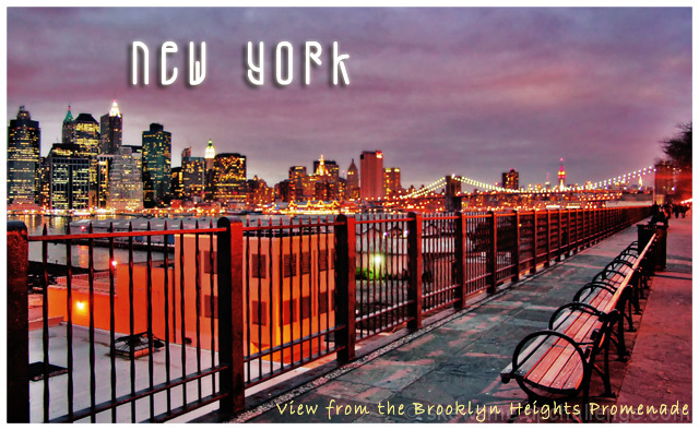
You're right, that was Pineapple's shot you just commented on. Thanks. Taken at the end of Montague Street. in retrospect, I think your postcard processing did the job. It's not always easy getting a good shot along the Heights. It's a nice view but awkward unless one has a nice wide angle... |
|
| Photographer found comment helpful. |
|
|
11/27/2006 11:09:45 AM |
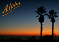
I like the diagonal lines of the benches, the fence, and the river with the lights of the bridge scooping up on the far right. You captured the great attraction of the Brooklyn Promenade: the walk, the benches, and the expansive view of Manhattan.
I like the text where it is. First of all, in the Western world, the eye reads from left to right and top to bottom. To reverse that would make the card a little uncomfortable. And second, the lower text is well situated on the promenade. |
|
| Photographer found comment helpful. |
|
|
11/27/2006 10:41:36 AM |
Lots to like about this shot - the diagonal, the equal emphasis on the cool-looking benches and Manhattan, and the processing.
I'd suggest moving "New York" to the right side. Above the buildings, the upper left corner ends up very dense while the upper right is empty. To keep the text balanced, then I'd move the lower text over to the left. |
|
| Photographer found comment helpful. |
Comments Made During the Challenge  |
|
|
11/26/2006 06:36:37 PM |
|
Good, not sure about upper text. |
|
| Photographer found comment helpful. |
|
|
11/24/2006 11:09:05 PM |
|
Nice shot of the lights and waterfront, colors, especially given the poor shooting conditions during the week in the northeast. I think that the fence is a little too dominant, that you should back up from it just a bit to lessen it's proportions. |
|
| Photographer found comment helpful. |
|
|
11/23/2006 08:28:28 PM |
|
| Photographer found comment helpful. |
|
|
11/23/2006 05:24:46 AM |
|
I started off not liking this shot when I saw the BG focus was so soft, but the more I looked, I realized that it really works here. Everything on this side of the fence is clear and looks photographic. The other side of the fence is out of focus just enough to make it look like an illustration. Even the text has the same qualities, sharp on the bottom right and slightly soft on the upper left. Nice job. |
|
| Photographer found comment helpful. |
|
|
11/21/2006 09:39:12 PM |
|
great use of vibrant color - it works very well for this postcard |
|
| Photographer found comment helpful. |
|
|
11/21/2006 10:55:20 AM |
|
nice POV. something about it, however, looks over-processed to me. |
|
| Photographer found comment helpful. |
|
|
11/21/2006 10:50:28 AM |
|
I like the perspective and oversaturation of colors. |
|
| Photographer found comment helpful. |
|
|
11/20/2006 02:18:34 PM |
|
This works fine for a postcard. Nice job of processing the sky in the background. Where is the red/orange glow coming from, the sunset/sunrise? It's almost too much, like this had the color saturation pushed a little too far maybe? Just an observation. Overall, nicely done. Good luck in the challenge. |
|
| Photographer found comment helpful. |
|
|
11/20/2006 09:59:33 AM |
|
That ghastly MTA ventilation building (the orange one) is one to be avoided at all costs in this view. You should have been more to the north... |
|
| Photographer found comment helpful. |
|
|
11/20/2006 09:03:50 AM |
|
my eyes can't stop anywhere, there is much to see. Lights across look a bit strange here. |
|
| Photographer found comment helpful. |
|
|
11/20/2006 03:43:55 AM |
|
Lovely image...the placement of 'new york' is not quite right...should have been a bit more to the left and slightly higher...great typeface though |
|
| Photographer found comment helpful. |
|
|
11/20/2006 01:07:41 AM |
|
excellent crop and exposure. |
|
| Photographer found comment helpful. |
Home -
Challenges -
Community -
League -
Photos -
Cameras -
Lenses -
Learn -
Help -
Terms of Use -
Privacy -
Top ^
DPChallenge, and website content and design, Copyright © 2001-2026 Challenging Technologies, LLC.
All digital photo copyrights belong to the photographers and may not be used without permission.
Current Server Time: 06/28/2026 05:32:09 AM EDT.