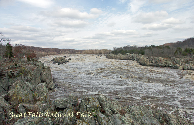
22 mm wide angle lens and monopod; adjusted levels, and shadows in PSE 4; add text; resized; saved for web.
Post Challenge: This is the Potomac River at high tide. Unfortunately, the water was muddy and it was hard to tell the difference between the water and the rocks. The leaves were also gone, so finding any color to increase was a challenge. Thanks for the suggestions.
Statistics
Place: 238 out of 266 Avg (all users): 4.9769 Avg (commenters): 4.2500 Avg (participants): 4.9083 Avg (non-participants): 5.0467 Views since voting: 896 Views during voting: 285 Votes: 216 Comments: 9 Favorites: 0
I always wondered what the view looked like from the Virginia side. Think I'll stick the to MD side. ;) Have you been there? The canal makes for some great images. I'm not too far from you - let me know if you're out shooting one day and you need company. As far as the image? Great falls is very hit or miss. Its so huge its difficult to do it justice in a photograph. I'm still not able to create a shot I'm satisfied with. But keep trying - kayakers are a great find when its high tide - only the brave ones go out. :) You had a great sky that day!
Ah, for some reason this reminds me of my Perspective entry and I have the same comment on yours as what I'm getting there: this could use a tad more saturation to make it more dynamic and add to the drama. Yours is a much better image than mine, so please take my comments with a grain of salt. I like the drama of the turbulent water and as I inspect this image more closely, I see that there's quite a bit of interest in the sky too! So this would be a perfect candidate for higher saturation and maybe some curves to bring out contrast. Looks like a wonderful place!
Nice capture of extreme scenery. Overall image feels gray, and I'm sure that the time of year doesn't help. Consider cranking up saturation/blues/contrast/shadows to compensate. A drop shadow on the title would also help.
The sky is pretty but seems a little washed out and it is hard to distinguish the rushing water from the rocks. A little more post processing may help make this pop
I'm not sure the desaturated look works for this scene, I'd have gone either with full color or B&W. Also the font is hard to read, it looks all jaggy.
This photo seems a little washed out. It would have been nice to see some more contrast between the sky and the landscape to give things some definition.






 Add photograph to your favorites
 Add photographer to your favorites

 Photographer found comment helpful.


