| Author | Thread |
|
|
12/03/2006 01:24:34 PM |
Looking at this photo, really five major thoughts come to mind...
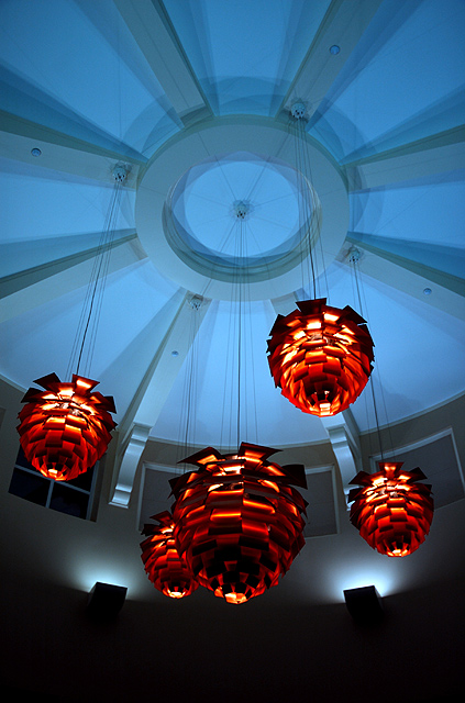
The colors make this work - I also like the dark below. Nicely seen.
Crop the top third of this image and it works out much better. It adds nothing to your image to keep that part of the ceiling.
whoa cool lights!
I really like the complementary colours and the effect...looks almost absract 8
nice shot, but where is the dramatic effect?
I hope this helps you on your quest to become a better photographer. Maybe you'll be as good as one woman who sharpens her images alot and thinks the lights are cool. All in time, all in time. |
|
 Photographer found comment helpful. Photographer found comment helpful. |
Comments Made During the Challenge  |
|
|
11/28/2006 02:23:52 PM |
|
The colors make this work - I also like the dark below. Nicely seen. |
|
| Photographer found comment helpful. |
|
|
11/24/2006 11:05:48 AM |
|
Crop the top third of this image and it works out much better. It adds nothing to your image to keep that part of the ceiling. |
|
| Photographer found comment helpful. |
|
|
11/22/2006 06:25:22 PM |
|
| Photographer found comment helpful. |
|
|
11/22/2006 02:00:31 AM |
|
I really like the complementary colours and the effect...looks almost absract 8 |
|
| Photographer found comment helpful. |
|
|
11/22/2006 01:16:56 AM |
|
nice shot, but where is the dramatic effect? |
|
Home -
Challenges -
Community -
League -
Photos -
Cameras -
Lenses -
Learn -
Help -
Terms of Use -
Privacy -
Top ^
DPChallenge, and website content and design, Copyright © 2001-2026 Challenging Technologies, LLC.
All digital photo copyrights belong to the photographers and may not be used without permission.
Current Server Time: 06/29/2026 06:43:16 AM EDT.