| Photograph Information |
Photographer's Comments |
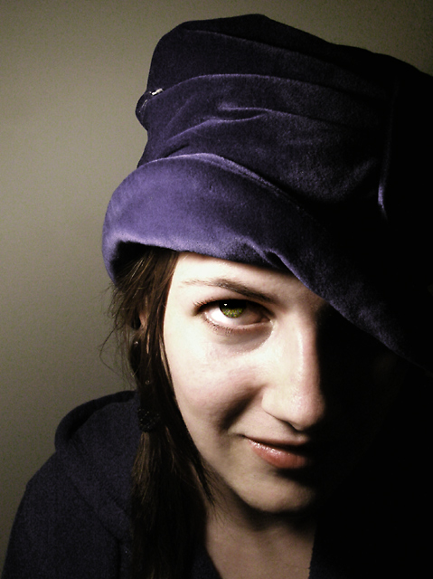
Challenge: Free Study XV (Advanced Editing IV)
Camera: Nikon Coolpix 5400
Location: Lakewood, CO
Date: Nov 12, 2006
Galleries: Portraiture, Self Portrait
Date Uploaded: Nov 12, 2006
|
A version of the blue velvet hat that isn't legal in Basic Editing, using some new tricks I've learned this weekend from  Djabordjabor and Djabordjabor and  jaxed and putting my own flair on it all. You're seeing a lot of self-portraits lately because I've been very busy studying for two classes and a business school entrance exam and haven't had any time to go adventuring. jaxed and putting my own flair on it all. You're seeing a lot of self-portraits lately because I've been very busy studying for two classes and a business school entrance exam and haven't had any time to go adventuring.
Convert from RAW
Crop
Duplicate Layers: Screen, Soft Light, Luminosity at various opacities
Desaturated background layer
Hue/Sat, Color Balance, Selective Color
Cut eyes to new layer, Color mode at about 80%: dodge highlights, burn shadows, brightness/contrast, and some fairly aggressive USM
Flatten Image
Clone skin flaws
Dodge eye whites, shadow under eye, some other skin shadows
Burn eyebrow, eyelashes, lips
Sharpen tool on eyelashes
Resize, USM, Save for Web |
| Author | Thread |
|
|
12/08/2006 07:23:54 AM |
|
Too bad this didn't score higher! It's a quite cool shot with an interesting atmosphere. Your lighting is very interesting, not the casual style you see every day. I don't think the shadows are unflattering - they add depth to the photo. I like your facial expression: On the one hand you look relaxed and happy. On the other hand you look as if you were up to something (I hope I used the right phrase here...). When I saw this during voting I thought this would be your new personal best. |
|
 Photographer found comment helpful. Photographer found comment helpful. |
Comments Made During the Challenge  |
|
|
12/03/2006 02:51:09 PM |
|
Pretty model but a lot of unflattering shadows here. The colours are very good. An extra point for her beautiful expression. |
|
| Photographer found comment helpful. |
|
|
12/01/2006 04:58:53 PM |
|
In some ways, I like this one a bit better than the first - though I didn't score the first one low (7). I prefer the skin and wall tones of the first, but the framing, pose & shadow is nicer here. Hmmmm... 8 |
|
| Photographer found comment helpful. |
|
|
12/01/2006 12:48:02 PM |
|
Classic colours. IMO, would be better with the eye averted downwards indicating a moment of introspection. |
|
| Photographer found comment helpful. |
|
|
12/01/2006 09:21:54 AM |
|
Love the texture of the hat. The lighting is a touch harsh on her nose and upper cheek. Great focus on her eye. |
|
| Photographer found comment helpful. |
|
|
12/01/2006 01:40:15 AM |
|
| Photographer found comment helpful. |
Home -
Challenges -
Community -
League -
Photos -
Cameras -
Lenses -
Learn -
Help -
Terms of Use -
Privacy -
Top ^
DPChallenge, and website content and design, Copyright © 2001-2026 Challenging Technologies, LLC.
All digital photo copyrights belong to the photographers and may not be used without permission.
Current Server Time: 06/29/2026 11:22:18 PM EDT.