| Author | Thread |
|
|
11/04/2006 12:30:43 AM |
Greetings from the Critic's Club
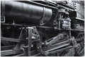
Initial Impression : The photo strongly evokes a sense of age, of ramshackle development, and of neglect. The sepia treatment enhances this sense.
Composition : Placement of the tracks in the photo draws the eye nicely. The way the poles and electrical lines sort of spiral out from there works well. I really like the sign. There is a bit of a sense of emptiness to the composition. That emptiness works to support the overall effect of the photo. The crop is very goodt.
Lighting, Exposiure & Processing: The focus seems just a tad soft, perhaps it is a consequence of other factors. The lighting is even, but it is a little flat. One of the consequences of flat lighting is that textures are subdued and hard to read. My guess is that more aggressive unsharp masking and some work with curves in Photoshop might bring out texture better. I like the darkness in the sky and the way the clouds work. I understand the motivation to make it look old and moody, but my personal sense is that the whole photo is hurt a bit by there not being some brighter highlight areas in the photo.
Overall: It certainly fits the railroad theme of the challenge. It is an interesting location and this is an appealing treatment.
This is, of course, just my opinion; I hope you find it helpful.
Best of Luck,
Steve Brubaker
|
|
 Photographer found comment helpful. Photographer found comment helpful. |
Comments Made During the Challenge  |
|
|
10/29/2006 08:59:43 PM |
|
Love the canvas texture used through this photo! Fantastic work! |
|
| Photographer found comment helpful. |
|
|
10/29/2006 10:17:36 AM |
|
The sepia and texture evoke a sense of nostalgia. Nice PP work, here. |
|
| Photographer found comment helpful. |
|
|
10/28/2006 11:44:20 PM |
|
Like the nostalgic feel of this image but I don't know if I would like it better without the linen texture. |
|
| Photographer found comment helpful. |
|
|
10/28/2006 07:09:44 PM |
|
Love the tone you picked. Works well. |
|
| Photographer found comment helpful. |
|
|
10/25/2006 09:25:03 PM |
|
The use of the texture creates an interesting effect here - like the paper itself is just behind the pole, and the shadow of the line running between the poles is falling on that paper. |
|
| Photographer found comment helpful. |
|
|
10/25/2006 12:41:10 PM |
|
how did you get this to look like paper? |
|
| Photographer found comment helpful. |
|
|
10/25/2006 02:55:26 AM |
|
Would have been a perfect 10 with out the canvas filter. |
|
| Photographer found comment helpful. |
|
|
10/24/2006 06:33:26 AM |
|
| Photographer found comment helpful. |
|
|
10/24/2006 03:41:30 AM |
|
nice composition and colors, but the canvas filter is very disturbing. if u used it because you had sharpness problems, better add noise next time |
|
| Photographer found comment helpful. |
|
|
10/23/2006 10:04:14 PM |
|
The color and texture is supurb. I really LIKE this shot and I would put it on my wall. 10 |
|
| Photographer found comment helpful. |
|
|
10/23/2006 08:17:22 PM |
|
| Photographer found comment helpful. |
|
|
10/23/2006 04:44:34 PM |
|
I like the sepia treatment, but not the texture. But that's just my opinion. Others might like it. A little too much for me. nice capture otherwise |
|
| Photographer found comment helpful. |
|
|
10/23/2006 04:13:34 PM |
|
Beautifully done. I'm sure you've gotten comments from both camps on this but I for 1 think the texture works very well here. Good job! |
|
| Photographer found comment helpful. |
|
|
10/23/2006 03:28:18 PM |
|
I don't understand why you would use a filter like that for a beautiful shot like this. |
|
| Photographer found comment helpful. |
|
|
10/23/2006 12:58:45 PM |
|
If I were choosing a texture for this shot I wouldn't have chosen water color paper or canvas. This looks like more of an old photo rather than a painting. It's a nice composition though, and I think the sepia works. |
|
| Photographer found comment helpful. |
|
|
10/23/2006 10:27:21 AM |
|
Pretty overall effect and tint. The experiment was worth while and adds something to the nicely desolate scene. 7. |
|
| Photographer found comment helpful. |
|
|
10/23/2006 07:10:15 AM |
|
Whats with the canvasy background O.O is that legal? |
|
|
|
10/23/2006 07:04:15 AM |
|
I am not a fan of the canvas filter actually, but the image is nice |
|
| Photographer found comment helpful. |
|
|
10/23/2006 07:01:25 AM |
|
This would have worked better without the "texture" background |
|
| Photographer found comment helpful. |
|
|
10/23/2006 12:24:47 AM |
|
I don’t usually like the effect filters, but this one works great. Very nice. |
|
| Photographer found comment helpful. |
Home -
Challenges -
Community -
League -
Photos -
Cameras -
Lenses -
Learn -
Help -
Terms of Use -
Privacy -
Top ^
DPChallenge, and website content and design, Copyright © 2001-2026 Challenging Technologies, LLC.
All digital photo copyrights belong to the photographers and may not be used without permission.
Current Server Time: 06/28/2026 11:43:20 PM EDT.