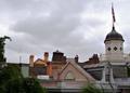
I love the colors on this one, the burnt oranges are wonderful, the balance is also very nice and the cropping top to bottom is close to perfect. But the overall shot is too much out of focus for my personal taste, a bit sharper and this would have gotten an 8 or 9 from me.
This is a great composition but it lacks some definition and contrast in the darker areas. A little play with the levels may have lifted this shot significantly.
Nice colors - could almost be a Hopper painting. I'd like to see a bit more sharpness in the architecture though. This is a good composition - I lke how you've placed the taller buildings toward the center - but not dead on center.






 Add photograph to your favorites
 Add photographer to your favorites


 Photographer found comment helpful.


