oh well- i still think you should have scored among the top photos, if not have been the winner. obviously only mainstream, postcard styles will "win" in the dpchallenge, but don't worry- I really like this photo, and I'm sure others do too. you wouldn't have prints available would you?
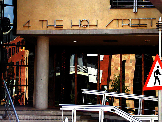
I think you had a really good idea here. However I find a couple things distracting. The sign for instance. I'd like to see it gone, but I think you could get away with including it. -anything other than cutting it off. My eyes follow the sign pole up to the beam in the corner. It needs to go as well. I do give you credit for not getting yourself in the shot. Good luck.
Interesting contrast between the solidity of the building and wavy reflections in the glass. Colors are good too, but I find the composition a bit too cluttered. Wish you had cropped out the traffic sign in the bottom right.
One of several refection images in this challenge (including mine). Your reflected images have great color to them. Wish you could get rid of that bright railing interfering with the view. I particularly like the leftmost reflection. I wish that one could have more prominence in the image.
This is a very busy photo, so many things going on, so many things trying to draw your attention in, the hand rails going in all different directions offset by the straight lines of the building. Excellent capture of the chaos that can come from the urban area. The reflections really did throw me off at first but upon a second, longer look I see how they again, help convey the sense of chaos and busy aspect of the photo. Raising the score on this one for sure!
The refelctions and building textures are great. The sign at the right is distracting. Could a different angle have eliminated it? Or is it a deliberate contrasst in texture and color with the rest of the photo?






 Add photograph to your favorites
 Add photographer to your favorites

 Photographer found comment helpful.


