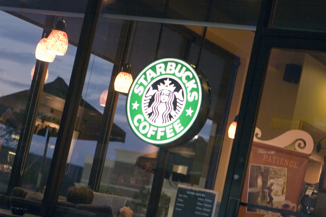
Taken early Saturday morning. I liked the colors and the way the man was reading the paper. This was my second choice for an entry... the first one was of my sleeping baby, but I was afraid how the voters might respond, so I went with this one. Hope it's okay.
Editing was pretty minimal. Raw adjustments on exposure, then ran curves & resized for web.
Statistics
Place: 179 out of 188 Avg (all users): 4.5300 Avg (commenters): 6.7500 Avg (participants): 4.5584 Avg (non-participants): 4.5122 Views since voting: 712 Views during voting: 290 Votes: 200 Comments: 7 Favorites: 1 (view)
Good morning! Let me start by saying that the longer I looked at and worked with this image, the more I fell in love with it. It has a few issues as presented here, but its got great bones (as my mother says). :)
For me, the image is a little soft. I pulled it in (at this size - different size images require differing amounts of USM) PS and gave it a USM of 67% at .8. This helped get the sign in tight focus. Also, there is truly no black point or white point. Not sure what you mean by running Curves but a great way to use curves is to click on the black eye-dropper and find the blackest point of the image and click there then click on the white eye dropper and find the whitest point of the image and click there. Adjust your mid-tones up and down. In my editing I adjusted the mid tones slightly darker.
I think your image tells a story - its a slice of life. Typically, 'slice of life' images do better here in B&W. I think conversion to B&W would have boosted your score. Not everyone likes odd angles. I think the angle works here but others may not. Its luck of the draw. I'm sure some people were put off by the Starbucks sign being smack dab in the middle. At first it bothered me and I tried cropping it, but the image lost something. I do think a very slight crop on the right and top helps focus the image.
As I said before, you have an image here with excellent bones. Its not to everyones tastes but who cares - as long as you like it. I like the story it tells about both the photographer and the subject. I think it works really well. I love the inclusion of the patience sign - we all need that now and then. Your score is what it is - don't take it to heart - some amazing images here have done poorly in voting.
I posted an edit in my workshop temporarily - where I went while playing around. Keep up the great work!
I like what you see deeper in this picture...the man reading the paper, the sign that includes the word patience. The bright sign in contrast to the dim glow of morning is good, and the diagonal lines indicate action...time to get started.
The shot is fine, but I don't like the angle of the image. I would prefer to see it rotated then cropped (maybe the vertical crop a little closer tot he red hanging 'patience' sign as the area to the right of it does not enhance the photo.






 Add photograph to your favorites
 Add photographer to your favorites


 Photographer found comment helpful.


