| Author | Thread |
Comments Made During the Challenge  |
|
|
11/05/2006 05:52:47 PM |
|
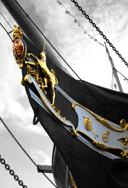
Good detail on this shot, but I think I would prefer to see a little more of the ship!! |
|
|
|
11/04/2006 04:54:18 AM |
|
nice use of desaturation though if you could have i woul have liked the flages form the mast to be in colour aswel, to add a little contrast in that area. good shot though. |
|
|
|
11/03/2006 04:40:44 PM |
Subject well focused and focal point: 1
Lighting: 1 (blown-out whites in sky take eye away from focal point IMO)
Composition: 2 (excellent)
Background: 1
First impression/ Wow factor: 1
Artistic "override": n/a
Total: 6 |
|
|
|
11/03/2006 05:49:50 AM |
|
I like how you have taken this one... |
|
Home -
Challenges -
Community -
League -
Photos -
Cameras -
Lenses -
Learn -
Help -
Terms of Use -
Privacy -
Top ^
DPChallenge, and website content and design, Copyright © 2001-2026 Challenging Technologies, LLC.
All digital photo copyrights belong to the photographers and may not be used without permission.
Current Server Time: 07/02/2026 06:30:59 AM EDT.