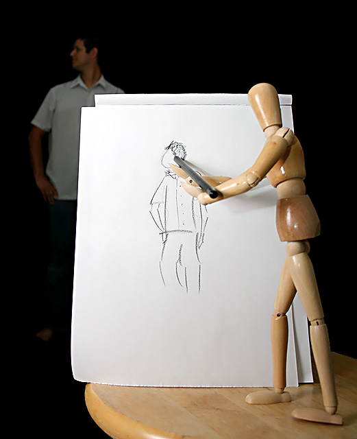
Natty idea: what fun. Find the spacing a bit "bitty"...too many primary characters...maybe a repositioning of the artist's page would make more of Woody adn his subject? At present the page is too dominant. But the stroy behind the composition is clever!
Or "Reversal of Roles".
It would look better with a more realistic sketch, of course, though you might not have had access to someone with the required training (or talent ;>þ)
Very cute reverse. But for some reason it just doesn't totaly work for me. Maybe a differnt angle, like looking over the woodies shoulder. or such. I think there is too much brightness from the paper overcoming the rest of the image. But it is a great idea.
This is unique and creative. I think the lighting in two places is going to pull this down some. The light is a little harsh on Woody with the resulting glare (diffusing the light would help). The "model" in back could use more lighting period. If you wanted to minimize the "model" it may have worked better to minimize using a shallower DOF and blur him out some - but get some light back there. :) All of this is JMO of course. Good luck in the challenge.






 Add photograph to your favorites
 Add photographer to your favorites

 Photographer found comment helpful.


