| Author | Thread |
|
|
10/11/2006 11:19:07 AM |
Originally posted by Jutilda:
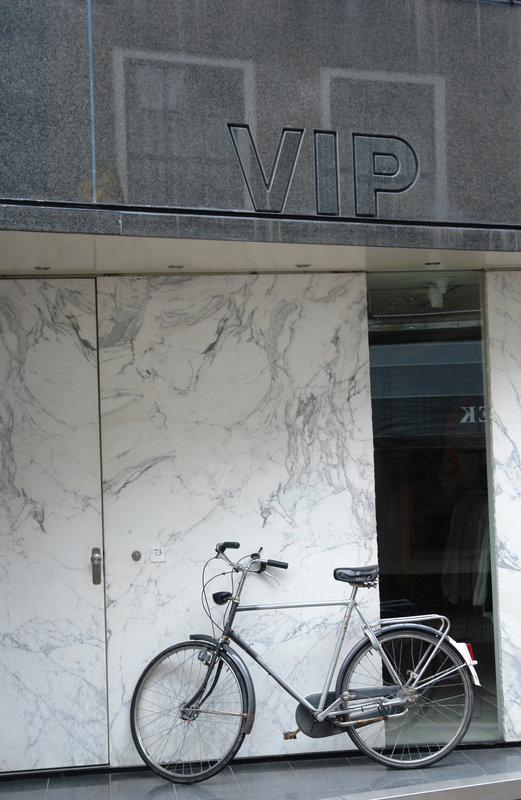
I really like the juxtaposition between the bike and the text of the building/glass. Nice and simple. I'd remove the date in red. |
Thanks - I agree. Finishing touches! |
|
|
|
10/11/2006 11:15:23 AM |
Originally posted by Germaine:
You might try cropping a little off the top so it all fits on a monitor screen. I'd also get rid of the date in red. Nice capture. Good example of "black and white in color". |
Thanks for your input - maybe the bottom right hand corner, as well. |
|
|
|
10/10/2006 10:33:08 AM |
|
You might try cropping a little off the top so it all fits on a monitor screen. I'd also get rid of the date in red. Nice capture. Good example of "black and white in color". |
|
 Photographer found comment helpful. Photographer found comment helpful. |
|
|
10/10/2006 10:01:19 AM |
|
I really like the juxtaposition between the bike and the text of the building/glass. Nice and simple. I'd remove the date in red. |
|
| Photographer found comment helpful. |
Home -
Challenges -
Community -
League -
Photos -
Cameras -
Lenses -
Learn -
Help -
Terms of Use -
Privacy -
Top ^
DPChallenge, and website content and design, Copyright © 2001-2026 Challenging Technologies, LLC.
All digital photo copyrights belong to the photographers and may not be used without permission.
Current Server Time: 06/24/2026 03:34:01 PM EDT.