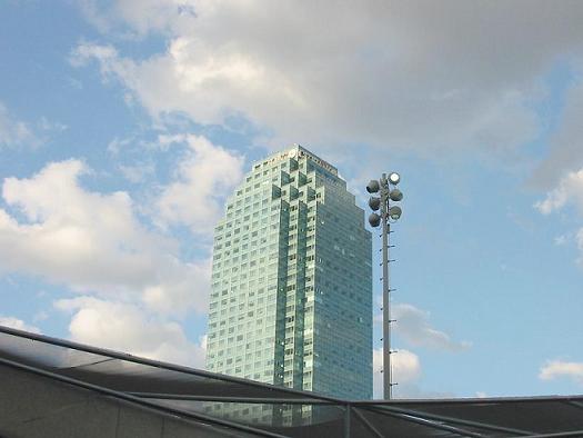
The cropping on this really left me wandering all over the picture. While the building in the center draws you in intially, the light pole to the right distracts you, even though the perspective is awesome, looks like it's the same size, but then the awning across the bottom again draws you away and distracts you.
You might have brought in more effect by boosting the contrast because the photo has a kind of flat feeling to it, the colors are kind of washed out in a way. Also trying a different composition so as not to center the building in your image would have benifitted. And the last thing is that the whole image has a definite lean to the right.
Compositionally not too interesting of an image. Building is too centered and appears to be ready to topple over. Also, I find the forground structure cumbersome, cropped unusually and obscures my view.





 Add photograph to your favorites
 Add photographer to your favorites


