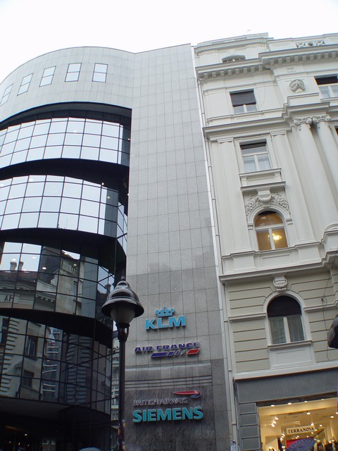
I like the juxtaposition you are showing, but I would have cropped out the logos and streetlight at the bottom. Then you could have also removed some of the featureless sky and had the striking contrast you are conceptualizing.
I like this picture but it might of had more of an effect if you had cropped off the bottem where theres the little yellow store is or maybe had more of the sky in the photo. very nice.
This is one of the more creative shots in this challenge. I am not sure if the angle you choose is the best but it does make an interesting negative space at the top where the sky shows (blown out but minor)
Well seen - IMO just needs a bit of crop on the right hand sideto get rid of that intrusive black object and possibly a bit of the bottom but very nice all the same. 7 would have been higher but for the above thoughts about the composition
This is really neat how the buildings are so different, yet 'attached'. I like your idea with this photo. I would rather see it straight rather than tilted, but otherwise a nice shot!
The perspective on this shot is a bit skewed... Was this intentional? If so, I don't see the need for it... The picture doesn't hold very much interest imho.






 Add photograph to your favorites
 Add photographer to your favorites


