| Author | Thread |
|
|
10/16/2006 09:55:24 AM |
Greetings from the critique club!
Cogratulations on your strong finish and fine macro!
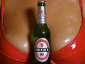
I would have no idea how the commercial photographers create condensation on beer bottles, but I imagine it is done with silicon or plastic droplets applied to the bottles in exactly the most strategic and appealing places. That way the bottle never dries out or gets soggy and they can plod along between photo and computer until they get exactly the result they want.
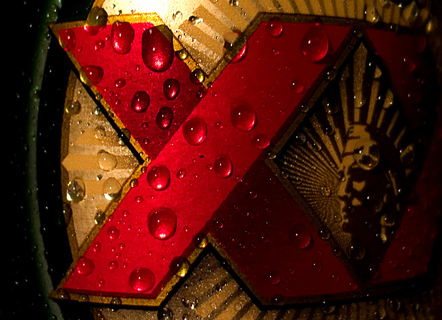
Under the confines of the basic editing guidelines there wasn't much you could do about the hot spot at the top of the label, nor could you crop out the the many light reflections that are so small to appear as digital noise. I'm sure that the agency producing magazine ads for Dos Equis would never have accepted all those little white specs all over their fabled Cuauhtemoc's cheek, and head dress. Interesting that this partcular challenge used the basic editing rules, when indeed the avertising agency itself is all about post production.
That's all I can say technically. Your shot is balanced, dynamic and well done. I can address the topic of brand familiarity. I know this label well because I drink beer and I live in Mexico. Many times advertisers will create such an ad just to remind the loyals they are still around. But if this ad were created to attract new customers, it doesn't include enough information. As another commenter suggests, the second X is obscured. We are pretty sure it's a beverage, because of the condensation. But can a new potential customer understand the brand? It all depends on your intent as a photographer and the medium in which the ad was to be placed.
Love your work. You get a 7 from me!!
russ
|
|
 Photographer found comment helpful. Photographer found comment helpful. |
|
|
10/16/2006 12:13:54 AM |
|
| Photographer found comment helpful. |
|
|
10/11/2006 09:00:19 PM |
|
Outsanding macro capture for this challenge. Congratulations on your top 20 finish. |
|
| Photographer found comment helpful. |
|
|
10/11/2006 03:01:19 PM |
|
Great shot. Congrats on your high finish! |
|
| Photographer found comment helpful. |
Comments Made During the Challenge  |
|
|
10/10/2006 07:47:37 PM |
|
Thumb caught my eye. Good colours. Nice shot. |
|
| Photographer found comment helpful. |
|
|
10/10/2006 08:56:59 AM |
|
Fist impression awesome! closer inspection reveals the hotspot, just a little too hot, and the dark side a touch too dark. |
|
| Photographer found comment helpful. |
|
|
10/10/2006 04:42:54 AM |
|
| Photographer found comment helpful. |
|
|
10/10/2006 03:40:07 AM |
|
| Photographer found comment helpful. |
|
|
10/09/2006 08:54:08 PM |
|
Great clarity...great beer! I'm giving it a 9! |
|
| Photographer found comment helpful. |
|
|
10/06/2006 10:15:21 PM |
|
Textbook like execution and ad. Nice tight crop isstill identifiable and I'm sure whats being sold. Condensation is perfect and the photo is abstract enough to allow for creative use of text. Very, very nice. The only pick (and its small) is that the whole "X" should be illuminated. 9 |
|
| Photographer found comment helpful. |
|
|
10/05/2006 05:42:48 PM |
|
Muy bien! I like the closeness and excellent colors. |
|
| Photographer found comment helpful. |
|
|
10/05/2006 02:51:40 PM |
|
I like the way the red and gold play off of each other. This is a great shot and perfectly subtle. |
|
| Photographer found comment helpful. |
|
|
10/05/2006 10:00:10 AM |
|
nice close-up, not seeing it condusive to adverstising |
|
| Photographer found comment helpful. |
|
|
10/05/2006 12:22:50 AM |
|
best i've seen so far in the challenge. so many don't show an advertising product shot... weird. but you do. :) i just wish the second X was a little more visible, but i know exactly what product this is, so it's okay. :) |
|
| Photographer found comment helpful. |
|
|
10/04/2006 09:18:15 PM |
|
| Photographer found comment helpful. |
|
|
10/04/2006 04:48:25 PM |
|
up close and personal. I like it. good luck |
|
| Photographer found comment helpful. |
|
|
10/04/2006 09:57:07 AM |
|
Real nice. Good light, good color and focus. |
|
| Photographer found comment helpful. |
Home -
Challenges -
Community -
League -
Photos -
Cameras -
Lenses -
Learn -
Help -
Terms of Use -
Privacy -
Top ^
DPChallenge, and website content and design, Copyright © 2001-2026 Challenging Technologies, LLC.
All digital photo copyrights belong to the photographers and may not be used without permission.
Current Server Time: 06/28/2026 03:11:46 PM EDT.