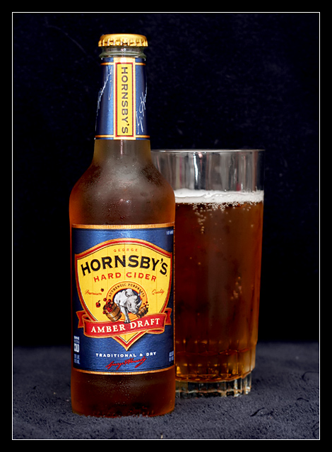
First attempt at a real "product shot".
Set up one of my Smith-Victor lights off to the right.
Aimed my Speedlite at the wall for bounce.
Processing:
Rotated to straighted up vertically.
Cropped.
Adjusted levels and curves.
Bumped up color with hue/sat.
Unsharp Mask.
Neat Image.
Added frame.
Saved for web.
I'm happy with the look of the product. Not crazy about the backdrop, but I couldn't find anything better.
Had to do two sessions. Just to make sure I was content. Also to make sure my thirst was properly quenched. ;-)
Statistics
Place: 43 out of 127 Avg (all users): 5.6592 Avg (commenters): 6.0000 Avg (participants): 5.4200 Avg (non-participants): 5.7050 Views since voting: 1067 Views during voting: 390 Votes: 311 Comments: 15 Favorites: 0
Standard, space-efficient bar card composition. The brew needs back or sub light to make it pop from dark bacground. Try gold foil strip strategically placed behind glass and bottle or cut hole in base material (towell?) and fire light up from underneath. Add salt to increase/maintain head during shoot. Good start.
6: A nice simple shot that would be well suited to an add. The lighting is a little bit harsh. I'll add an extra point (7) to compensate for those that may vote low as this isnt beer or soft drink.
Not bad. Focus should have been on the big label though. It's blurred enough to be a distraction when it should be the highlight of the image. Reflections on the top of the glass should go (black sheet behind you?) Good job.
Nice presentaton of product. Dust in carpet and reflection in glass are two avoidable distractions (fill glass more and dust off carpet). Nice comp lends itself well to text placement. Nice job aside from small fixable details.
I really like the colour and the comp...I like the frost on theglass and bottle, but I don't care too much for what you have used as a base (towel?) this makes the image look cheap and ametuerish...perhaps some black card would have been better





 Add photograph to your favorites
 Add photographer to your favorites


 Photographer found comment helpful.


