| Author | Thread |
|
|
10/16/2006 08:47:19 PM |
greetings from the critique club!
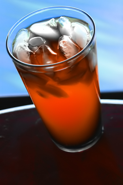
Congatulations on attempting new ground! I can see from your portfolia that you have a creative eye and are not afraid to take risks. While your self critisism is perhaps to harsh ("lame"), I think we can discuss a few ways that might strenthen your image.
I think that the comments that you received about over "Neat-imaging" are valid. I imagine that your goal is produce an irresistable beverage. To me that implies the need for crisp, clean, and refreshing. By softening the tones you work against that goal. We are left with a rather ho-hum drink that matches the rather ho-hum sky.
There are distracting technical elements that could not be cured in a basic editing challenge, but in post production (or in pre-shot planning)I would get rid of one of the horizontal lines. The currved white tables edge competes poorly with...(is that the balconeys edge?) the other strong horizontal. Alot of distortion exists between this "balconeys edge" and the horizon. I might have wiped up the mess from the root beer float experiment...the dirty table does nothing for "clean and crisp".
Compositionaly I am am set off by a couple of elements. I think what you want acheive is that the viewer wants to jump into the frame and take a sip. The tilted angle of the glass and table, with no corresponding angle with the liquid in the glass leaves me wondering when will this glass overflow, or when will this glass slide right off of the table. I'm left feeling like I better run for a towel.
Perhaps your intent was to create the effect that the beverage might just slide out of the frame and into my hand? Compositionaly, let's work on enhancing that concept. I am a big fan of strong diagonal lines, and you acheive part of this effect by your angled pesentation of the glass. But wouldn't that concept be more effective with the glasses base positioned in the lower right corner. The diagonal line would be more emphasized, the meaningless foreground would be out of frame, and you would gain the emotions of anticipation and expectation. Wouldn't that help you improve the emotive of the dreamy ice cubes blossoming into the dreamy sky?
Nice work. You get a 6 from me!!
russ
|
|
Comments Made During the Challenge  |
|
|
10/10/2006 01:35:16 AM |
|
I want some of that dreamy looking ice! |
|
|
|
10/06/2006 10:24:08 AM |
|
The effect on the ice is really great and so are the colors. I find this shot really interesting and I wish you had managed to have a different table border because I find the straight line somewhat out of place. |
|
|
|
10/05/2006 08:57:03 PM |
|
6: The colours are nice but the way the light is reflecting in the ice makes the cubes look like blobs of cream. The angle also seems to be in between a vertical glass and a deliberate unique alnge on the glass |
|
|
|
10/05/2006 07:54:08 PM |
|
mmmm, good pic, no logo :( |
|
|
|
10/05/2006 03:02:13 PM |
|
Strange effect, but I like it |
|
|
|
10/05/2006 11:18:56 AM |
|
A what?! :D Nice colors. Could have called this a smoothie with all the NI (noise reduction) applied here. He-he. |
|
|
|
10/05/2006 10:00:47 AM |
|
waaaay too neatimaged/denoised |
|
|
|
10/05/2006 06:32:34 AM |
|
|
|
10/04/2006 04:47:58 PM |
|
I'm not sure if I'd drink something of this texture, but it looks real cool |
|
|
|
10/04/2006 01:03:27 PM |
|
This is very nice on the eye I think. |
|
|
|
10/04/2006 12:17:34 PM |
|
Nice effect and colors. I'm not crazy about the white line, but the rest is very good. |
|
|
|
10/04/2006 10:21:31 AM |
|
I couldn't see any carbonation so it comes off looking more like a glass of iced tea. Nice colors and layout (composition). |
|
|
|
10/04/2006 09:58:23 AM |
|
This works. Nice lighting, soft focus and comp allow room for text. |
|
|
|
10/04/2006 05:39:11 AM |
|
I really like this...the neat image work (?) has added a nice smoothe touch that suits this...great colours |
|
|
|
10/04/2006 01:25:39 AM |
WOW!!
what rich colours and what a smooth texture! good job... |
|
Home -
Challenges -
Community -
League -
Photos -
Cameras -
Lenses -
Learn -
Help -
Terms of Use -
Privacy -
Top ^
DPChallenge, and website content and design, Copyright © 2001-2026 Challenging Technologies, LLC.
All digital photo copyrights belong to the photographers and may not be used without permission.
Current Server Time: 06/29/2026 05:20:36 PM EDT.