I really like this albiet I'd like to see it sharper The divisions between the sections and interesting comp lends itself to creative text placement. Very nice overall concept.
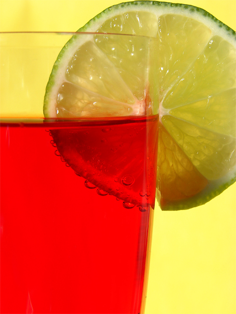
Something about the color combination here that weakens the initial impact. I think the yellow background is competing too strongly with the red for attention and the green is getting a back seat when the lime slice should be front and center. Did you look at it with a white background, even a royal blue maybe? Just a thought. I like the way you've put this together. The scale and layout is very good. Best of luck to you in the challenge.





 Add photograph to your favorites
 Add photographer to your favorites


 Photographer found comment helpful.


