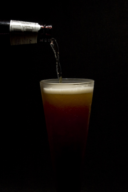
Technical: Focus and depth of field are spot on. Color, saturation and hue are realistic, which is needed for this type of image.
Reaction: I like the way the beer glass fades to black. Gives a bit of extra feel to the image. Could also be a subliminal message that the calories seem to dissapear. Would also leave room for needed text, were this a real beer ad.
If we were looking at real beer ads; the image here while very well done, never shows the name on the bottle or on the glass. For a real ad this would be a sin. Personally I like a little thicker head.
Overall a very good and convincing photo. I wouldn't be suprised to see on like this in a magazine, or on a billboard.
i really like your idea of having the fade off effect at the bottom, very cool. second thing that came to mind was how interesting would it have been to have the bottle pouring straight on to keep a very weird symmetricalness to the image, to enchance the odd lighting
I really like this.Nice and subtle with lots of negatie space (I.E. room for text.) Lighting on the label is a bit harsh but that's a small repairable item. The advetising world isn't constrained by basic editing rules. Very very nice ad and presentation of product.
good idea and well done, but something is missing, some extra kick to this photo. hope you understand what I'm trying to say, since I almost don't understand it mayself :)





 Add photograph to your favorites
 Add photographer to your favorites

 Photographer found comment helpful.


