| Author | Thread |
Comments Made During the Challenge  |
|
|
10/07/2003 03:51:56 AM |
|
Great message, not the best pic but will still give you an 8 for the idea alone. |
|
|
|
10/07/2003 03:25:32 AM |
|
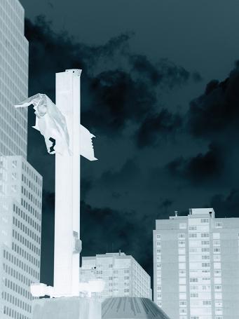
i like the tones on the sky, but not the tones on the buildings and the cross. 7 |
|
|
|
10/05/2003 01:27:26 PM |
|
Good catch, well executed. |
|
|
|
10/04/2003 10:36:48 AM |
|
conveys a cold powerful tone, well done 10 |
|
|
|
10/04/2003 09:09:34 AM |
|
|
|
10/04/2003 03:54:13 AM |
|
Seems totally appropriate to me to have religion at "Ground Zero", what better place? |
|
|
|
10/02/2003 05:09:30 PM |
|
I tihnk it's very hard to use the negative/inverted image to often come out better than the original. However, I think you made a good choice here by using it. The inverted sky REALLY brings out the foreground. Nice job. |
|
|
|
10/01/2003 10:41:11 PM |
|
|
|
10/01/2003 07:32:55 PM |
|
base 1: 1/1; challenge: 0/3; technical: 0/3; aesthetics: 0/3; total: 1 |
|
|
|
10/01/2003 05:44:26 PM |
|
interesting subject, makes you think, I like your reverse effect - perhaps we are supposed to look at the image from different perspectives? It all comes togetehr nicely. |
|
|
|
10/01/2003 01:18:36 PM |
|
|
|
10/01/2003 12:19:12 PM |
|
Good take on irony I feel. The negative look is different and I personally like it. |
|
|
|
10/01/2003 10:02:49 AM |
|
I don't think using a negative of your image adds anything to the idea you are trying to present |
|
|
|
10/01/2003 09:20:20 AM |
|
I get the irony but I don't like the inverted colors, the shot itself is very good but not the coloring. |
|
|
|
10/01/2003 08:24:58 AM |
|
Home -
Challenges -
Community -
League -
Photos -
Cameras -
Lenses -
Learn -
Help -
Terms of Use -
Privacy -
Top ^
DPChallenge, and website content and design, Copyright © 2001-2026 Challenging Technologies, LLC.
All digital photo copyrights belong to the photographers and may not be used without permission.
Current Server Time: 06/28/2026 09:22:24 AM EDT.