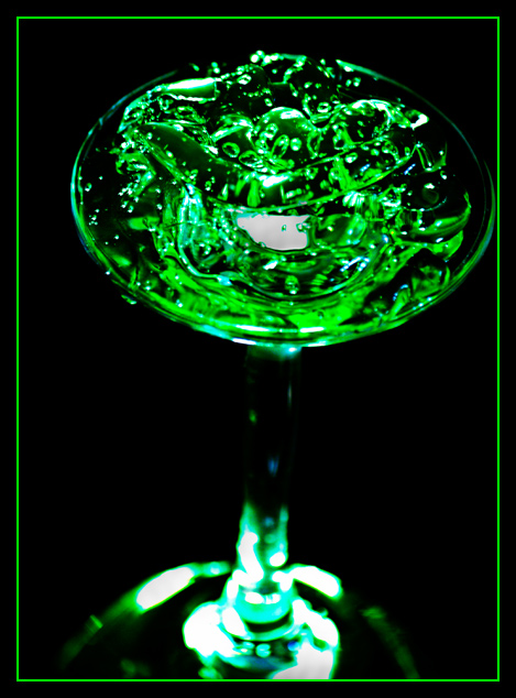
First of all I like the idea, certainly unusual! I am not so keen on the slight lean the glass has or the fact it is almost touching the border on the right handside. Although centrally placing subjects is mostly a no no I think this would have worked well if it had been straight and in the middle of the frame. I have to agree with some of your commenters that the brightness of the green in the border is very distracting and does not help the overall look of the image.
Technicals:
I like your use of DOF here as it helps draw the viewer to the 'goop' on the top of the glass. The lighting does seem a little harsh and there are a few patches that appear a little blown out.
My personal thought:
Taking a little extra care with your composition and lighting would have given you a few extra points here IMHO
If you've got any questions about this critique, please feel free to contact me via the PM system.





 Add photograph to your favorites
 Add photographer to your favorites

 Photographer found comment helpful.


