|
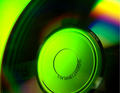
very nice, but i think it would have been a better composition if it was cropped closer. the lines and colours are a little too swirly, almost vertigo inducing. plus, the fact that the centre of the image is out of focus makes it quite hard to look at. 7. |






 Add photograph to your favorites
 Add photographer to your favorites


 Photographer found comment helpful.


