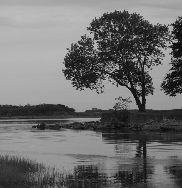
Shot in color with my 18-70 and a polarizing filter. Changed to grayscale in PSCS2. Auto Levels. Neat Image. Cropped and resized. Simple but serene. Taken in Cape Porpoise Maine.
Statistics
Place: 149 out of 251 Avg (all users): 5.2538 Avg (commenters): 5.0000 Avg (participants): 5.1277 Avg (non-participants): 5.3689 Views since voting: 1211 Views during voting: 276 Votes: 197 Comments: 13 Favorites: 0
I like the simplicity of this shot, I agree a little with some of the previous comments that it could be a little brighter, it just depends on what you were going for with this shot. The little ripples in the water & slight reflection is very nice.
I'd have been tempted by a tighter crop, or a stance about a foot over to the right, to just avoid getting that second tree creeping in. Still a nice moody shot though, b&w works well.
I like it even if I think that the image is too flat. the contest is advanced editing hence I think that you can clone out the second tree on the right. there aren't a great light and a great sky. 6
The focus seems to be on the near middle foreground ripples of water rather than the tree....whatever is in focus will demand to be the "subject" of an image. A little cropping from the right to rid the image of that intrusive second tree would help as well.
I like the idea of this but the overall feel of it is rather flat. Sometimes black and white conversions do that when there isn't enough contrast to begin with. If you study it, you'll see mostly shadows (black) and midtones (gray) but hardly any highlights( white). Hope this is helpful. ;~D







 Add photograph to your favorites
 Add photographer to your favorites

 Photographer found comment helpful.


