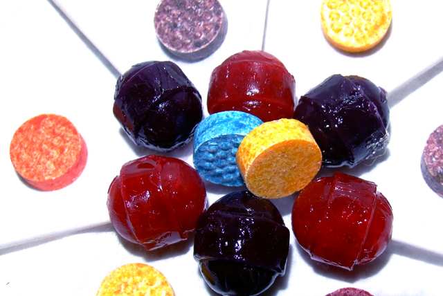
I scored this a 5. Met the challenge (I love candy), but the presentation here is a bit lacking. A different choice of candy (the round ones are a bit boring) and a different layout could have helped. I think set up shots like these that have a design or pattern really need to be clean and sharp. I see what you were going for but it just wasnt executed like it could have been. 4.2 might be too low though.
I think with just the suckers, arranged like a lot of folks arrange colored pencils (ie the center in one of the thirds, then radiating out from there) would have worked very well. Lighting is a bit on the harsh side, but by gosh, I still can't quite figure how to do that well without simply shooting my cat in his chair when the sun has moved over the top of the house (which is how I get that light, by the way.)
Back to comment: Sorry to be so blunt but this image has several technical issues that will negatively affect your score. First, the sucker sticks blend into the white background and would not even be visible if it wasn't for the shadows. I would suggest using a light colored background next time (Light blue or green maybe). Second, it looks like you arranged the candy in a pattern but the image wasn't cropped symmetrically. Third, the candy wasn't really arranged in a manor that makes the voter's wish they had thought to enter this image.






 Add photograph to your favorites
 Add photographer to your favorites


 Photographer found comment helpful.


